
Tile
Bathroom Accent Wall Ideas: A Practical Tile Guide
04.24.2026
08.27.2025

In This Article
When planning a tile installation, grout color is often an afterthought, but it can dramatically shape the look and feel of your space. Whether you’re working with classic white subway tile, bold colored tile, or anything in between, the right grout color can highlight, soften, or completely transform your design. Here’s how to choose grout color for your project, with real-world examples to help you visualize the possibilities.
Pairing white grout with white or light tiles delivers a crisp, unified appearance that instantly brightens a space. This combination is a favorite in bathrooms and kitchens, where openness and a sense of calm are often top priorities. With grout lines that nearly vanish, the tilework forms a smooth, uninterrupted surface—perfect for anyone seeking an airy, uncluttered atmosphere or a minimalist look.
In this New York bathroom, white grout on white tile creates a gentle, nuanced effect, letting the tile’s texture and finish take center stage. Where the same grout meets gray tile, the contrast adds a subtle highlight, drawing the eye and giving the space dimension.

Also showing white tile with white grout is this Brooklyn bathroom. This approach acts almost like a blank canvas, allowing other design elements—such as the band of black tiles—to stand out and define the room’s personality.

When paired with softly colored or pastel tiles, white grout brings a gentle, uplifting quality to the space. The light grout lines outline each tile just enough to define the pattern, while still allowing the delicate hues to take center stage. This combination keeps the overall look airy and fresh, making it a great choice for spaces where you want a hint of color without overwhelming the room’s sense of calm. After all, just imagine this pastel bathroom with dark grout instead of white; the resulting visual impact would be much different, now wouldn’t it?

With richly colored tiles, like those in this bathroom, white grout creates a more pronounced contrast that energizes the design. The bright grout lines frame each tile, emphasizing the boldness of the color and the geometry of the layout. This approach draws attention to the vibrancy of the tiles, making them a true focal point while still maintaining a sense of balance and clarity in the space.

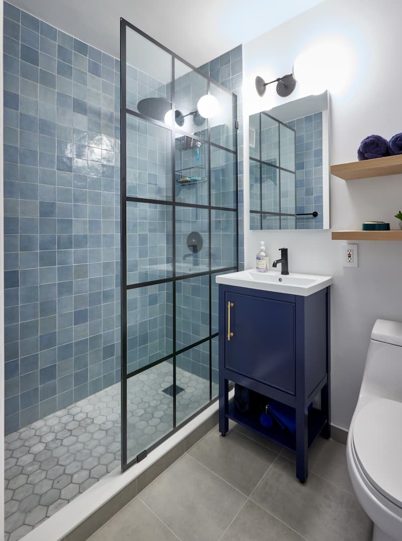
White grout with dark tiles produces a striking, graphic effect. The contrast between the grout and tile outlines each tile, emphasizing the pattern and layout. This approach is often used to create a bold, modern look, especially in spaces where you want the tilework to stand out as a design feature. It’s a confident choice that brings energy and movement to the room, as shown by this New York bathroom.

Choosing a dark grout for white or light tiles is a popular way to add definition and visual interest. The grout lines become a design element in their own right, framing each tile and making the pattern pop. This look is especially effective with classic subway tile, where dark grout can lend a contemporary, urban edge. It can also draw attention to richly patterned tile layouts, like with this New York kitchen.

It’s also practical—darker grout tends to hide stains and discoloration better than lighter options. This makes it a great choice for high-traffic areas or kitchens where spills are more likely to occur.
Pairing dark grout with neutral tiles creates a sophisticated, tailored look. The contrast is less dramatic than with white tiles, but it still adds depth and structure to the design, as with this Brooklyn bathroom. This combination works well in both modern and traditional spaces, offering a sense of refinement and balance.

Gray or Neutral Grout
Gray or neutral grout is a versatile choice that works beautifully with a wide range of tile styles and colors. When paired with white or light tiles, a soft gray grout creates gentle definition, outlining each tile without drawing too much attention. This subtle contrast adds depth and interest while maintaining a calm, cohesive look. For patterned or colored tiles, gray grout can help unify the design, allowing the tile’s color and texture to shine without overwhelming the space.
Beyond its visual appeal, gray or neutral grout is also a practical option. These shades are more forgiving than bright white, helping to mask everyday stains and discoloration—especially in busy kitchens and bathrooms. Whether you prefer a cool gray, warm taupe, or classic beige, neutral grout offers a timeless foundation that complements both modern and traditional spaces, ensuring your tilework remains fresh and balanced over time.
Choosing a grout color is about more than just picking a shade that “goes” with your tile—it’s an opportunity to shape the entire atmosphere of your space. Start by thinking about the mood you want to create and how much you want the tile pattern to stand out. Do you want your tilework to blend in quietly, or do you want it to make a statement? The right grout color can help you achieve either effect, or something in between.
The amount of space you leave between tiles—called the grout joint—can have a big impact on the final look of your project. Narrow grout joints (around 1/16 inch) are often used with precisely cut tiles and lighter, neutral colors to create a smooth, modern surface where the tile color takes center stage. This approach is ideal if you want a clean, continuous look that lets subtle hues or sleek finishes shine.
Wider grout joints (1/8 inch or more) are a great way to add character, especially with handmade or boldly colored tiles. The extra space allows the grout color to play a more prominent role in the design. Choosing a contrasting grout can make vibrant tiles stand out even more, while a matching or neutral grout will soften the transitions and create a more blended, cohesive effect. The right spacing, paired with thoughtful color choices, helps set the tone for your entire space.
Choosing the right grout color can feel like a leap of faith, but Block’s free AI Visualizer Tools for bathrooms and kitchens make it easy to preview your ideas before any work begins. Upload a photo of your space and enter the changes in tiles and grout you’d want to see. Visualize firsthand how subtle or bold grout choices can change the look and feel of your room—so you can make decisions with confidence and excitement.
For more articles to help inspire your own bathroom remodel, read:
At Block Renovation, your vision is always the starting point. We connect you with contractors who are not only highly skilled, but also genuinely invested in bringing your ideas to life. Every contractor in our network is carefully vetted for craftsmanship and professionalism, so you can feel confident that your project is in capable hands. From the first conversation to the final walkthrough, you’ll work with experts who listen closely, respect your goals, and are dedicated to creating a bathroom that truly reflects your style and needs.

Renovate confidently with Block
Easily compare quotes from top quality contractors, and get peace of mind with warranty & price protections.
Tile
Bathroom Accent Wall Ideas: A Practical Tile Guide
04.24.2026

Tile
Best Tile Brands for Porcelain, Vinyl & More
03.20.2026

Tile
2026 Bathroom Tile Trends for Walls & Floors
03.03.2026

Tile
Mixing Bathroom Tiles for a Contemporary Look
02.25.2026

Tile
Fully Tiled Bathroom Design - Pros and Cons
01.06.2026