
Cabinets
Brown Cabinets With White Countertops: Design Guide
06.04.2026
01.26.2026

In This Article
Painting your cabinets is one of the most effective ways to refresh a kitchen, whether you’re renovating your space or simply looking for an affordable, high-impact update. The right cabinet color can transform the energy of the entire room, influencing the way it feels, functions, and even how much time you want to spend there.
While style is personal, the process of choosing a color doesn’t have to feel overwhelming. By zeroing in on the factors that matter—light, layout, and your own tastes—you can pick a cabinet color that complements your kitchen, works with your daily life, and feels just right to you.
Your floors and countertops are major visual anchors in your kitchen, and your choice of cabinet color should work in harmony with them. To achieve a cohesive look, consider how the tones, patterns, and finishes of these surfaces interact with your potential cabinet colors. Here are a few tips to guide your decision:
Neutral cabinet shades such as off-white, gray, or taupe tend to pair seamlessly with a wide variety of flooring and countertop materials, from classic wood and stone to modern quartz and concrete.
If your countertops or floors have bold patterns or colors, opt for understated cabinets that balance and anchor the room.
For simpler, solid surfaces, feel free to choose a cabinet color that brings personality or a pop of fun to your space.
Collect samples of your flooring, countertops, and potential cabinet swatches to see how they look together in your kitchen’s lighting.
Take hardware finishes into account to ensure a unified appearance across all elements.

"Tones can lean either warm or cool. Pick one undertone family and stick with it throughout your space."
Lighting and exposure. Kitchens often receive varying levels of sunlight throughout the day, which changes how paint colors look. North-facing rooms feel cooler and can make blues and greens more pronounced; south-facing kitchens get more intense light, which brings out the warmth in creams and yellows. If you have limited natural light, lighter colors can help make the space feel more open.
Kitchen size and layout. Darker colors tend to make smaller kitchens feel cozier, while light hues can visually expand compact spaces. In roomy or open-concept kitchens, bold colors can bring definition and drama to an island or a wall of cabinetry. For galley kitchens or rooms with compact footprints, softer shades often create a more inviting flow.
Pairing colors with countertops and backsplashes. The materials and tones of your countertops and backsplash play a big role in choosing cabinet colors. For example, classic white cabinets pair beautifully with marble or engineered stone countertops and offer a crisp contrast to bold, patterned backsplashes. Earthy stone countertops work well with warm greys, taupes, or deep greens. If your backsplash has distinct colors or patterns, consider pulling a subtle shade from the design for your cabinets to tie everything together. Remember to balance busy surfaces with more subdued cabinet tones, and use hardware to create a cohesive look across all elements.
Personal style and home aesthetics. Think about how you want your kitchen to feel in the context of your whole home. Crisp white cabinetry often suits contemporary and classic spaces, while bold blues, greens, or even black cabinets stand out in modern or transitional homes. If you live in a historic home, muted pastels and aged finishes can work beautifully.
Maintenance and lifestyle. Some colors are more forgiving than others. Darker paint can help disguise minor marks or scuffs, while very light shades may require a bit more upkeep to keep looking pristine.
While the best color is always the one that resonates most with you, these reliable options are favorites of both design professionals and homeowners:
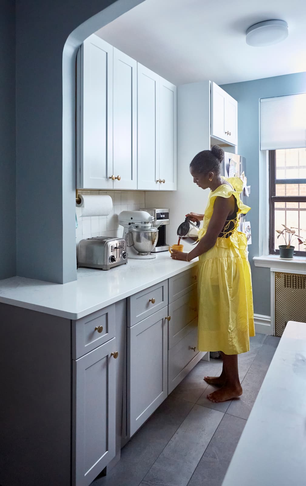
Ideal for creating an airy, bright kitchen that feels spacious and timeless. White pairs well with any backsplash or hardware, and it reflects available light throughout the room. Satin brass or matte black hardware can add a modern edge, while polished nickel or chrome keeps things classic. White cabinetry can also serve as a blank canvas, letting you refresh the space with new accent colors or accessories as trends change.
For a more layered, inviting effect, try soft neutrals. Greige (a blend of gray and beige), light taupe, or creamy off-white work well with wood floors or natural stone countertops. Brushed gold or antique bronze hardware brings warmth to these palettes, while matte black can create subtle contrast. These hues are versatile and tend to feel welcoming and cozy in both traditional and modern kitchens.
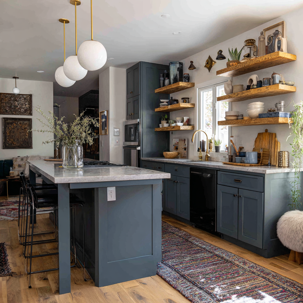
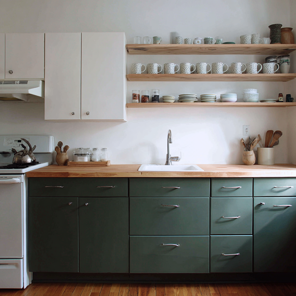
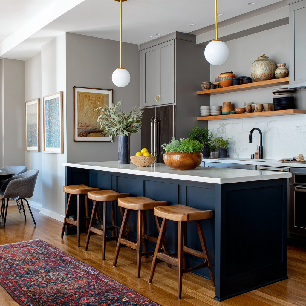
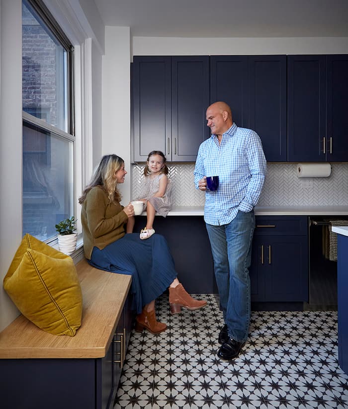
Deep greens (sage, olive, or forest) and classic navy blues bring both color and calm to your kitchen. These shades evoke nature and work especially well with brass or matte black hardware. Pair with open shelving or wood accents for a cozy, curated look. Earthy tones like these can add richness and personality to your kitchen while remaining sophisticated and timeless.
Consider painting lower cabinets or an island in a contrasting color for a balanced, modern twist. For example, navy base cabinets with white uppers or a black island anchored in an otherwise light kitchen. Professional designers love pairing bold bases with hardware in polished nickel or gold for an elevated, custom feel. Two-toned cabinet schemes are perfect for introducing color without overpowering the space, and they can highlight architectural details.
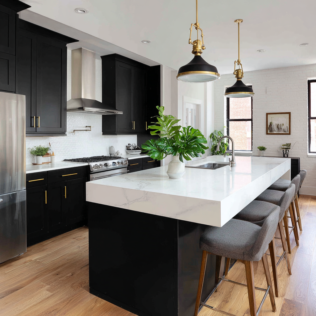
Dark cabinets create striking contrast and work especially well in larger kitchens or open-concept spaces. Matte finishes provide a subtle look, while glossy paints catch light for depth. Brass pulls and knobs pop against these shades, while matte black hardware creates a seamless, dramatic vibe. Dark cabinets can make a bold statement and are excellent for creating an ultra-modern, luxurious atmosphere.
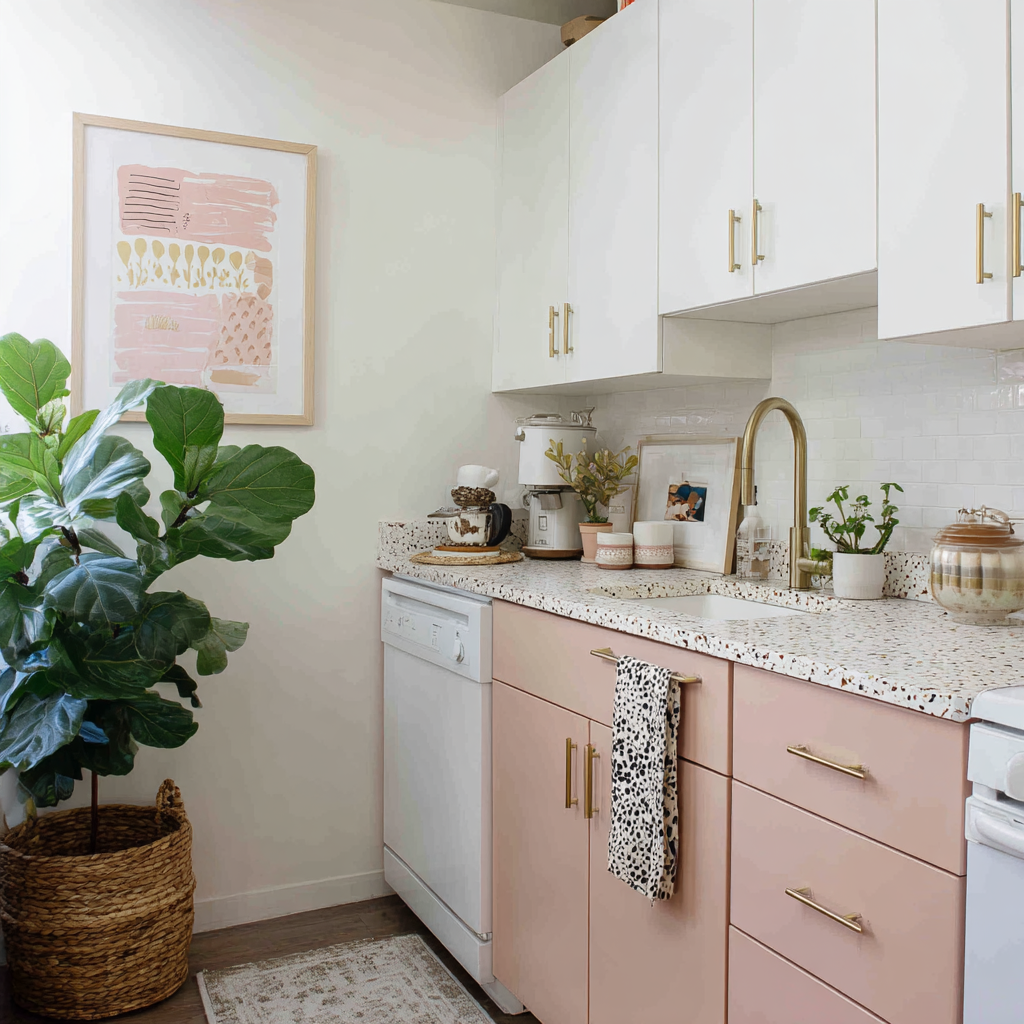
Muted tones like pale blue, mint, or blush bring a gentle warmth and vintage feel to the kitchen. Pastels work beautifully in cottage-style or eclectic homes, especially when paired with white or light butcher block countertops. Choose classic chrome or glass hardware to enhance the softness, or go with aged brass for a nostalgic twist. Pastel cabinets can make smaller kitchens feel unique and cheerful without feeling overwhelming.
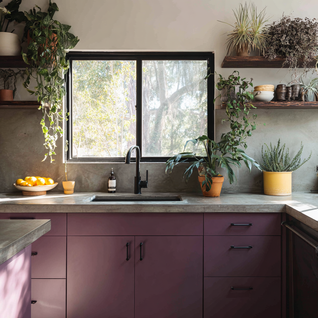
Colors such as emerald, deep plum, or dark teal deliver a luxurious, bold aesthetic that makes a statement. These shades work best as accents—like an island or a coffee bar—rather than throughout an entire kitchen. Gold or copper hardware can add extra richness and depth to this dramatic palette, while black or bronze adds a grounded touch. Jewel tones provide a sense of drama and elegance, instantly elevating the look and feel of your cabinetry.
Choosing the right cabinet color is a process, and a few simple strategies can make all the difference. Consider these key tips before you commit:
Test samples at home. Paint a large sample on a cabinet door or poster board and observe how the color changes in different lighting throughout the day. Compare it against your countertops, backsplash, and floors to ensure harmony.
Think beyond trends. While color trends can inspire, focus on what genuinely appeals to you and works with your home’s character. Classic shades tend to stand the test of time and offer long-term satisfaction.
Coordinate hardware and finishes. Once you narrow your paint choices, hold up hardware samples (like knobs or pulls) to see how finishes like chrome, brass, or matte black partner with your chosen color. The right hardware can elevate your cabinets and pull the entire look together.
Consider the finish type. A satin or semi-gloss finish is often best for kitchens. These finishes are easier to clean and more resistant to stains or fingerprints than flat or matte paints, making them both beautiful and practical.
An expert tip from Allie Weiss, Block’s Head of Brand: “Follow the 60/30/10 rule. This means about 60% of your space should be dedicated to your dominant color—think your kitchen cabinets or your wall paint. Then use about 30% of your space for your secondary color. This might be the color that you use on your sofa, your curtains, or pieces of furniture. About 10% of your space should be reserved for your accent colors. This might come into play with things like lamps, art on the wall, or small decor objects.”
Two-tone cabinetry is a trend with staying power, offering visual interest and the chance to personalize your space. This approach typically involves painting upper and lower cabinets (or an island and perimeter cabinets) in contrasting but complementary colors. It’s a great way to introduce bold or dark shades without overwhelming the room, and it allows you to highlight architectural details or create a focal point—such as a deep navy island with crisp white uppers. To tie the look together, coordinate hardware and accent finishes across both tones for a unified yet dynamic effect.
Overlooking undertones: Even neutral colors have cool or warm undertones that can shift depending on adjacent surfaces.
Forgetting about the rest of the home: Make sure your kitchen coordinates with surrounding rooms for a cohesive flow.
Rushing the process: Always test samples and live with them for a couple of days before committing.
Ignoring your lifestyle: Opting for hard-to-clean finishes or colors that show every smudge can mean more frequent touch-ups and maintenance.
Neglecting hardware compatibility: Choosing paint hues that clash with your hardware’s finish can throw off the entire design.
Skipping professional help: For complex color palettes or two-tone designs, consulting with a designer can help avoid costly mistakes.
Choosing a cabinet color can be easier—and more fun—when you can actually see your ideas come to life. Block’s Renovation Studio lets you experiment with different cabinet paint colors, hardware finishes, and countertop pairings in interactive 3D models of your kitchen. Instantly see how your favorite combinations will look together, and try out bold choices or subtle changes with confidence before making any permanent decisions. The Studio also offers real-time budget insights, so you know exactly what to expect as you plan your dream kitchen.
Finding—and seeing—the perfect cabinet color is just the beginning. With Block Renovation, you gain access to expert design guidance, powerful visualization tools, and professional project management to turn your vision into reality. Whether you’re updating a single kitchen wall or embarking on a full remodel, Block ensures every step is streamlined, transparent, and tailored to you. Let us help you bring your dream kitchen to life—with a color palette you’ll love every day.
Remodel with confidence through Block
Connect to vetted local contractors
We only work with top-tier, thoroughly vetted contractors

Get expert guidance
Our project planners offer expert advice, scope review, and ongoing support as needed
Enjoy peace of mind throughout your renovation
Secure payment system puts you in control and protects your remodel

Renovate confidently with Block
Easily compare quotes from top quality contractors, and get peace of mind with warranty & price protections.
Cabinets
Brown Cabinets With White Countertops: Design Guide
06.04.2026
.webp?width=640&name=u5821215421_Three-quarter_angle_view_where_70_of_the_frame_is_6ec560a5-707c-4e76-b31c-a0fdeb867a6d_0%20(2).webp)
Cabinets
Extending Kitchen Cabinets to the Ceiling: Before & After
05.25.2026

Cabinets
Refacing vs. Replacing Cabinets - 2026 Costs
05.08.2026
.jpg?width=640&name=2bd1b82f-617c-4494-84e2-63d1ac0f87f8%20(1).jpg)
Cabinets
Two-Tone Kitchen Cabinet Ideas to Inspire Your Renovation
03.19.2026

Cabinets
2026 Kitchen Cabinet Trends: Colors, Hardware, and More
03.02.2026