
Design
Wainscoting vs Board and Batten: How to Choose
07.06.2026
01.06.2026

In This Article
If you’re looking for a way to give your kitchen—or any room in your home—a bold, curated look without adding visual clutter, color drenching might be the design move for you. This approach to interior design involves painting the walls, trim, cabinetry, and sometimes even ceilings, moldings, and painted beams in a single, saturated hue. The result is immersive and striking, making even the smallest or darkest rooms feel cohesive, memorable, and thoughtfully designed.
But while color drenching is a simple concept, pulling it off gracefully takes some planning. Here’s how to approach this trend so your space feels intentional and inviting, not overwhelming.
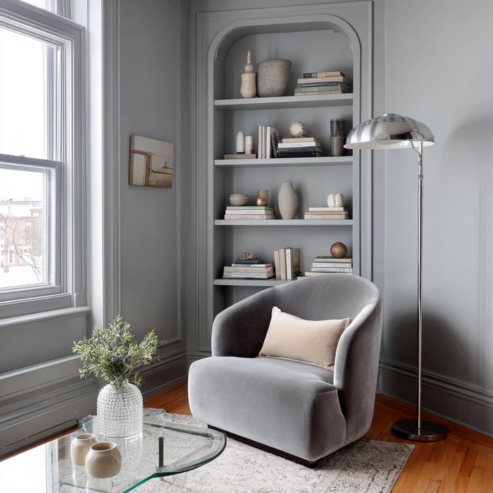
Color drenching is all about commitment to one color across every surface—walls, woodwork, doors, and sometimes furniture or built-ins. Instead of relying on accent walls or pops of contrast, you let a single shade envelop the entire space. This technique can make rooms feel larger by eliminating visual breaks or transform awkward layouts into sophisticated design statements.
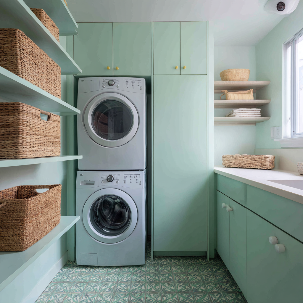
In a kitchen, color drenching can easily extend to cabinet doors, shelving, and even backsplashes or flooring for a genuinely unified effect. It’s especially effective in apartments or windowless kitchens, giving personality and polish where typical variations might add too much contrast.
Color drenching goes beyond aesthetics—it delivers real functional and emotional value to your home.
Creates a sense of unity and calm: When walls, trim, ceilings, and even furnishings blend in one shade, the space feels curated and intentional. Visual cohesion reduces clutter and allows any room—large or small—to feel more restful.
Highlights (or disguises) architectural details: Painting all surfaces the same color lets you choose what to spotlight and what to let recede. Moldings, doors, or built-ins can either stand out with a change of sheen or become part of a unified whole.
Expands compact or awkward layouts: With fewer color breaks, there are fewer visual boundaries. The eye glides around the room, so small spaces or tricky layouts feel larger and more open.
Makes a strong style statement: Whether you love a jewel tone or a timeless neutral, color drenching is a way to showcase your personal style with confidence and sophistication.
Simplifies interior design decisions: Focusing on a single palette streamlines your process. With fewer accent colors to choose, you can spend more energy on finishes and details.
Creates a beautiful backdrop: A monochrome envelope lets furniture, artwork, and textiles take center stage, making special pieces truly shine.
Design a Home That’s Uniquely Yours
Block can help you achieve your renovation goals and bring your dream remodel to life with price assurance and expert support.
Get Started
Picking the right color is the most personal—and the most important—decision when you commit to color drenching. Here’s how to choose with confidence:
Observe the room’s natural and artificial light: Colors look very different in sunlight, shade, or under various bulbs. Paint large test swatches on every wall and see the color throughout the day.
Consider undertones and the mood you want: Want warmth and coziness? Choose reds, ochres, or olive tones. Prefer a fresh, airy feel? Lean toward soft blues, greens, or muted greys. Let the color’s temperature reflect how you want to feel in the space.
Match color intensity to room use: Deep or saturated colors can feel cocooning in bedrooms or dens, while lighter hues can energize kitchens and workspaces.
Reflect on the space’s size and function: In smaller rooms, mid-tones and lighter hues won’t overpower. In large spaces, richer colors can dial up coziness.
Gather inspiration and test multiple samples: Look at magazines, design galleries, and real-life examples. Pick a few candidates and test generously—never rely on a tiny chip.
Account for existing finishes: Take flooring, stonework, permanent fixtures, and even major furniture into account, testing your color next to each to ensure harmony.
Plan for continuity: Think about how the drenched room will connect visually with adjacent spaces—whether through doorways, hallways, or open-plan layouts.
Don’t overlook sheen: Finish affects the color’s look and feel. Go for a consistent sheen for total unity, or try eggshell on walls and semi-gloss on trim for the faintest hint of contrast.
.png?width=1024&height=1024&name=u5821215421_A_narrow_hallway_fully_color-drenched_in_olive_gr_b210e255-6f3d-4d20-8f5e-8c68afbcc4e3_1%20(1).png)
While almost any color can work for color drenching, some shades have become clear favorites thanks to their versatility, mood-setting abilities, and timeless appeal. Here are five commonly chosen colors and what makes them so effective for your interior design:
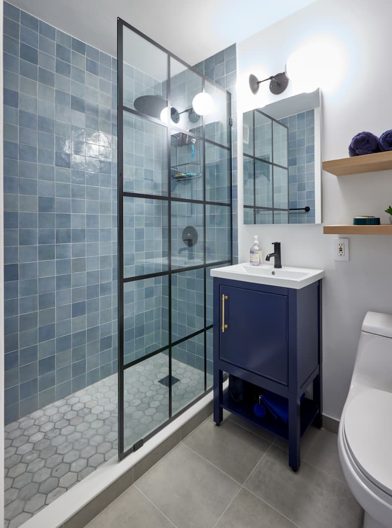
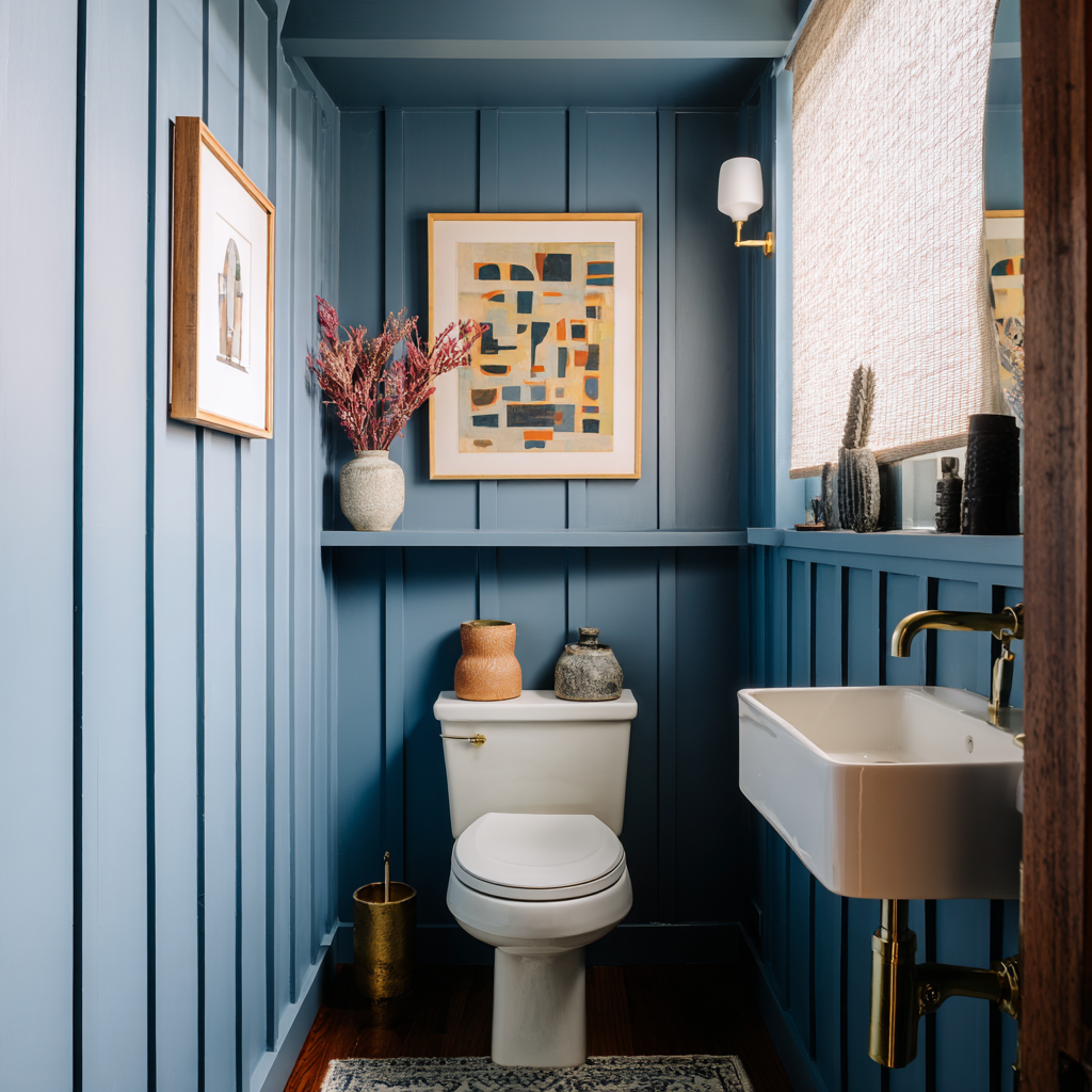
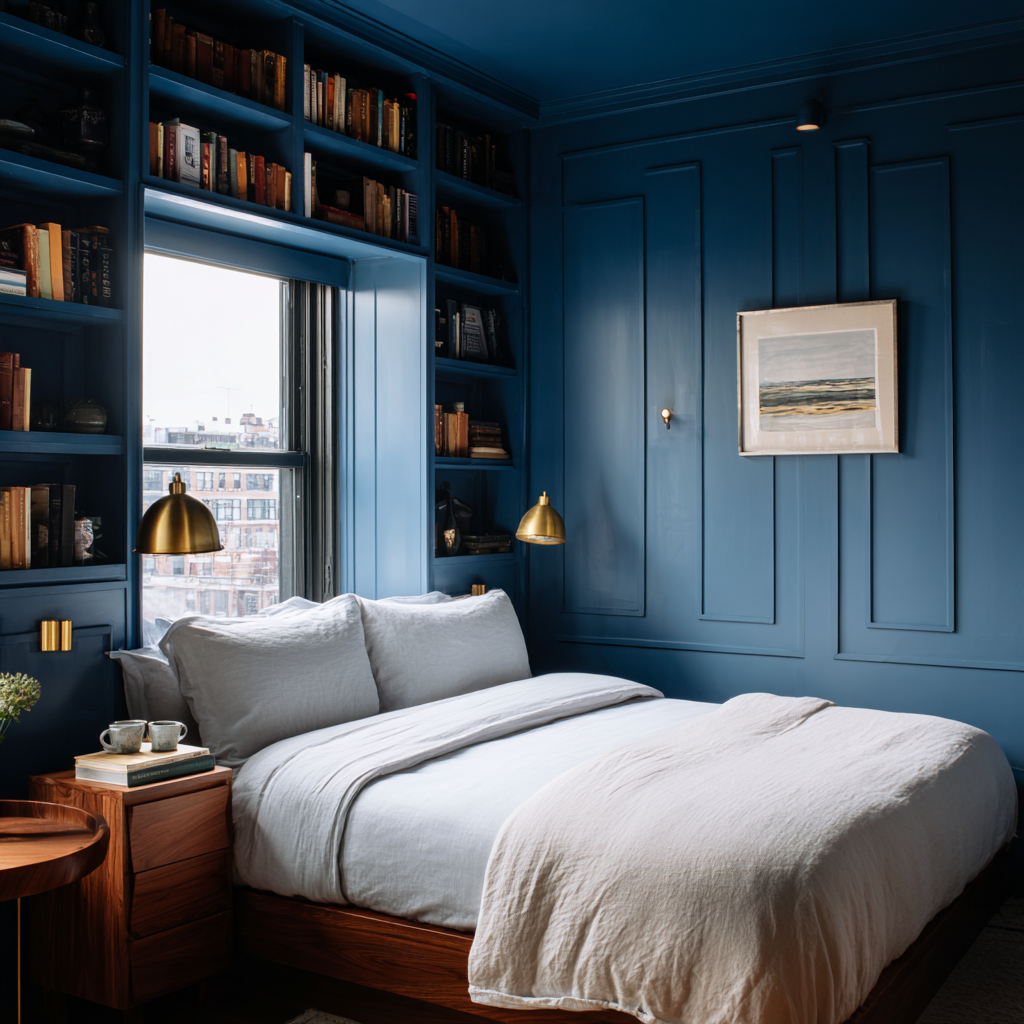
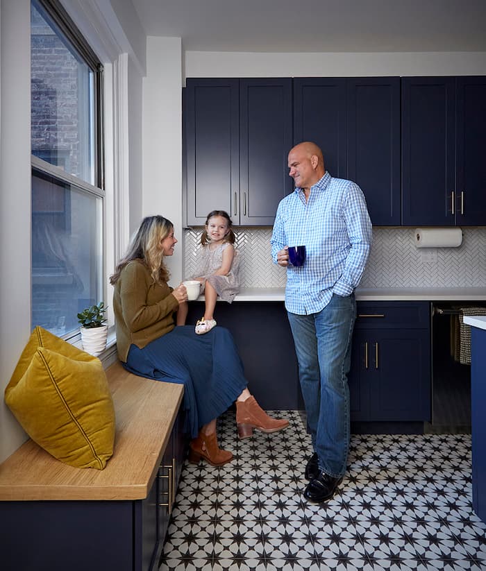
Navy blue brings a feeling of sophistication and calm while remaining classic and approachable. When used across walls, trim, and ceilings, navy envelops a space without making it feel heavy or overwhelming. It pairs beautifully with metallic finishes (like brass or gold), natural woods, and both traditional or modern furnishings, offering flexibility for a range of styles.
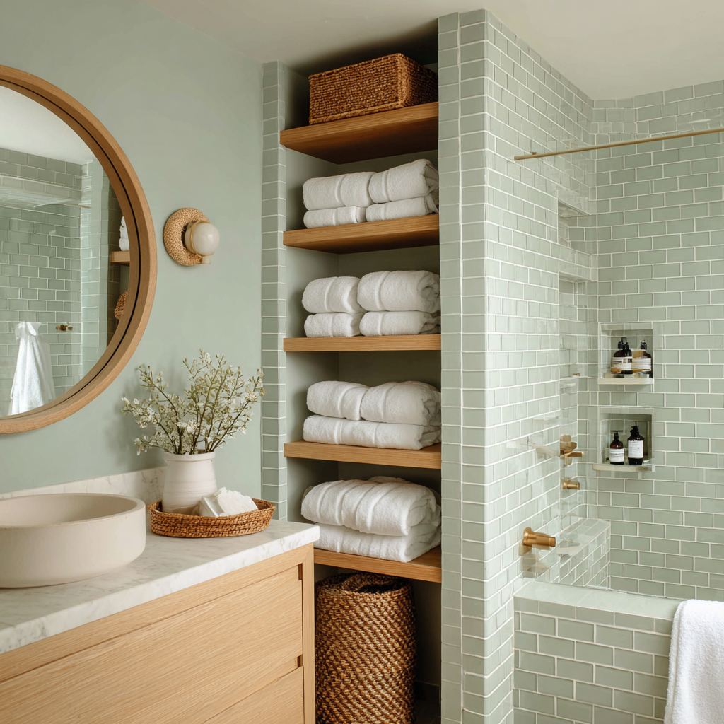
Sage offers a sense of tranquility and balance, echoing the natural world and creating a peaceful retreat. Its earthy undertone makes it restful on the eyes and easy to live with daily. As a backdrop, sage complements neutral furnishings, light woods, and warm metals, and it works especially well in kitchens, bedrooms, and bathrooms.
Terracotta infuses a room with warmth and energy, channeling Mediterranean and Southwestern style. This rich, earthy color feels both energizing and grounded, making spaces feel inviting and full of character. Terracotta works whether you lean traditional or modern and looks great paired with creamy whites, warm woods, and woven textures.
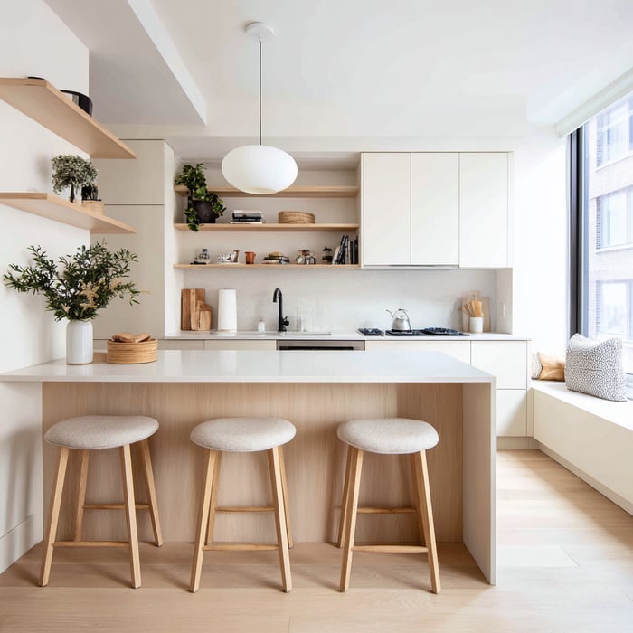
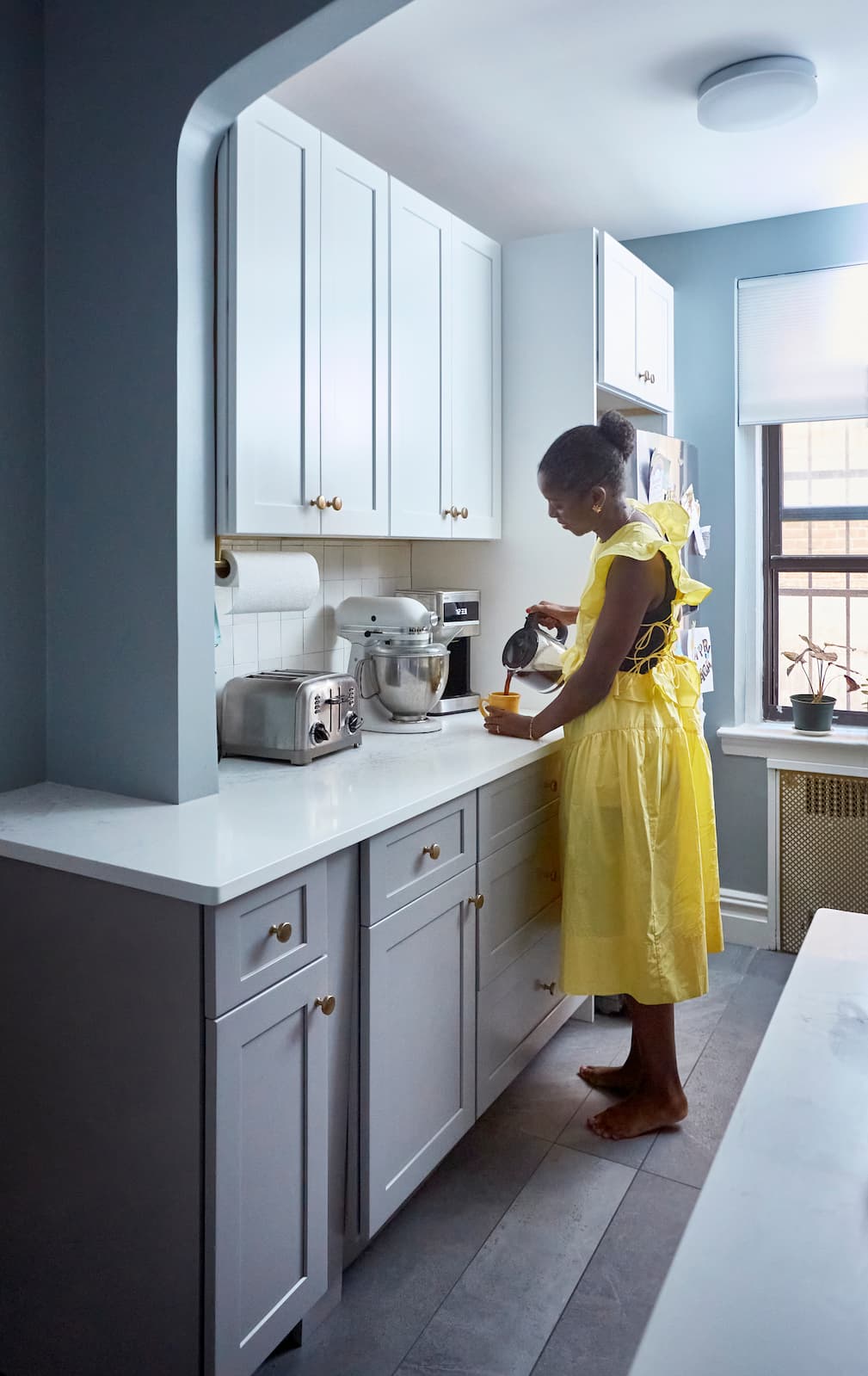
Drenching a room in soft, creamy white delivers understated drama—everything looks cohesive, walls recede, and the space feels open and airy. White is highly reflective, making the most of available light and providing a timeless backdrop for art, plants, and bold accents. Unlike stark or cool whites, soft whites keep a space feeling welcoming rather than clinical.
These shades are popular not just for their beauty but for their ability to set a mood, blend with many other finishes, and provide a long-lasting foundation you won’t tire of easily. For inspiration, read White Kitchen Cabinet Design Ideas for a Modern Home and How to Get the Details Right in a Small White Bathroom.
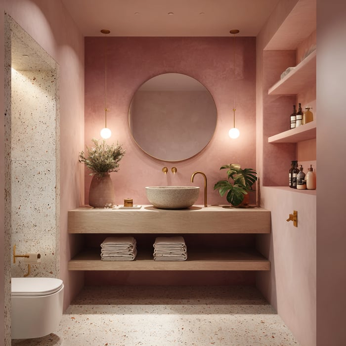
Dusty blush—a muted, barely-there pink—has become a favorite for its ability to bring both warmth and a sense of modern sophistication to a space. Unlike brighter pinks, this gentle, dusky hue adds a soft glow without overwhelming the senses. It pairs effortlessly with warm metallics, light woods, and neutrals, making it versatile for bedrooms, living areas, or even bathrooms. Dusty blush can make a space feel cozy and uplifting, and it strikes a unique balance between trend-forward and timeless.
Color drenching works best when every detail gets considered. Here’s a step-by-step guide to doing it right:
Consider painting the ceiling and “invisible” elements:
True color drenching extends to the ceiling, plus details like radiators, outlet covers, and vent grilles to maintain the uninterrupted look.
Include built-ins and key furniture:
If you have bookshelves, benches, wardrobes, or a standout piece of furniture, painting them in your chosen color deepens the impact.
Plan sharp transitions to other spaces:
Use clean lines at doorways or archways for a crisp boundary between a drenched room and adjacent spaces.
.png?width=1024&height=1024&name=u5821215421_A_bathroom_fully_wrapped_in_plum_purple_with_seam_ef98c3b8-1c0a-43f1-86b0-0514e00c9109_2%20(1).png)
Allow enough drying time and use multiple coats:
Rich colors may need a tinted primer and two or more coats for true saturation and durability. Don’t rush the process.
Finish with coordinated accessories:
For a layered look, choose hardware, soft goods, light fixtures, and décor that blend into your chosen hue or offer gentle textural contrast.
Check your lighting plan:
Because a single color can change character at night, prep your lighting for flexibility. Add layered, adjustable lights—ceiling, task, wall, and mood—to bring even, balanced illumination.
Renovate with confidence every step of the way
Step 1: Personalize Your Renovation Plan
Step 2: Receive Quotes from Trusted Contractors
Step 3: Let Us Handle the Project Details

Color drenching can elevate your home, but success is all about avoiding a few classic pitfalls:
Not planning your lighting: A single color can fall flat if lighting is too harsh, too dim, or too uneven. Layer your lighting and opt for warm bulbs to bring out richness and depth.
Skipping large test areas: Relying on a swatch or guessing at the shade from a brochure can backfire. Always test generously in multiple spots and review at different times of day.
Ignoring sheen and prep for different surfaces: Gloss, satin, and matte finishes can highlight flaws or disrupt unity if used inconsistently. Prep carefully and decide in advance if trim or built-ins will get a different sheen.
Over-accessorizing with contrasting décor: Too many bold accents, patterns, or off-palette pieces can undercut the soothing power of a unified look. Introduce contrast thoughtfully with subtle textures, metallics, or natural woods.
Disregarding the emotional impact of color: A color that excites you on day one may feel overwhelming or tiring over time, especially if it’s very bold or deep. Allow yourself time to sit with a color and reflect before you commit.
Not considering ease of maintenance: Deep, matte shades can show fingerprints, smudges, or wear, especially in high-traffic rooms. Choose a washable paint for busy areas, and keep an extra quart for any touch-ups.
By tuning into lighting, sampling carefully, planning your finishing touches, and being honest about how you want to live in your space, you can harness the full impact of color drenching—and enjoy a result that feels beautifully tailored and truly yours.
Ready to see how color drenching could transform your space? With Block’s Renovation Studio, you can experiment with bold or subtle palettes, visualize your rooms before making a commitment, and fine-tune every detail to suit your style and comfort.
When you're ready to move from ideas to action, Block Renovation connects you with expert planners, top-tier contractors, and every resource you need to bring your vision to life—clearly, confidently, and with a homeowner-first approach every step of the way.
Remodel with confidence through Block

Connect to vetted local contractors
We only work with top-tier, thoroughly vetted contractors

Get expert guidance
Our project planners offer expert advice, scope review, and ongoing support as needed
Enjoy peace of mind throughout your renovation
Secure payment system puts you in control and protects your remodel

Renovate confidently with Block
Easily compare quotes from top quality contractors, and get peace of mind with warranty & price protections.
Design
Wainscoting vs Board and Batten: How to Choose
07.06.2026

Design
Open Concept Kitchen Remodel: The Right and Wrong Way
07.04.2026

Design
Retro Futurism Interior Design for Your Remodel
06.23.2026

Design
14 Home Remodeling Websites for Smarter Planning
06.17.2026

Design
Walk-In Closet Design Ideas & Remodeling FAQs
05.06.2026