
Flooring
Best Engineered Wood Flooring Brands (2026 Real Reviews)
05.25.2026
01.22.2026

In This Article
Choosing floor tiles is one of the most significant design decisions you’ll make for your space. Flooring is far more than just a backdrop—it influences how light moves through the room, shapes the feeling of the home, and sets the foundation for your entire interior style. Factors like material, size, and finish matter, but the color you select for your tile has the greatest day-to-day impact. It affects how large or intimate a room feels, brings warmth or coolness, and influences comfort with every step.
Since floors are a long-term element in any renovation, it’s essential to get the color exactly right. While trends can inspire, focusing on function, lifestyle, and visual harmony will help you arrive at a timeless solution. This comprehensive guide walks you through everything you need to find the perfect floor tile color—ensuring your choice is just as stunning five years from now as it is on day one.
Light vs. dark colors: Light-hued tiles like white, cream, and pale gray reflect light and make spaces feel open—a smart pick for compact rooms or those with limited windows. Darker tiles, including espresso, charcoal, and slate, absorb light to create coziness and depth, anchoring larger rooms or loft-like spaces.
Warm vs. cool tones: Warm colors—beige, tan, brown, terracotta, and warm gray—create an inviting, familiar mood. Cool tones like blue-gray or crisp white establish a sense of calm, cleanliness, and modernity.
Neutral vs. bold colors: Neutrals provide unmatched longevity and flexibility, adapting as your taste shifts or furniture evolves. Bold-colored tiles make a statement, energizing a space, but sometimes limiting future design refreshes.
Turn your renovation vision into reality
Get matched with trusted contractors and start your renovation today!
Find a Contractor
Room size: Lighter colored tiles work best in smaller rooms, helping them feel bigger and airier. Dark tiles add intimacy and drama in larger, open-plan spaces.
Ceiling height: If your ceilings are low, aim for lighter floors to visually lift the space. Higher ceilings give you more freedom to use richer, darker flooring for balance.
Natural and artificial light: Rooms filled with sunlight easily handle dark or deeply colored tiles, while spaces with little light do best with lighter options that reflect and boost brightness.
Existing elements: Always consider cabinetry, counters, wall paints, and furniture. Floor tiles should work in harmony with these features, never clashing or vying for attention.
Classic and endlessly versatile, white and off-white tile floors immediately brighten rooms, making them feel more expansive and fresh—especially in bathrooms, kitchens, and contemporary designs. Their high reflectivity enhances available light, keeping spaces uncluttered and open. Choose these shades for a look that stays timeless and pairs easily with both vivid and muted palettes. These tiles are a staple of minimalist, Scandinavian, and modern design, beloved for their simplicity and brightness.

Beige, taupe, sand, and other earth tones bring warmth and adaptability. These colors create a soft, welcoming effect and help floors recede visually, letting other design features shine. They’re the go-to for multi-functional, open-plan homes where seamless flow from room to room is desired. You'll see these shades often in traditional, Mediterranean, farmhouse, and transitional spaces where inviting, grounded aesthetics are key.
.jpg?width=900&height=1200&name=111682b2-3a7d-46d1-960d-f655558b1f43%20(1).jpg)
Gray floors have become a signature of 21st-century interiors, thanks to their remarkable flexibility. Available in both cool and warm undertones, gray tile balances dimension and neutrality—light gray for a minimal backdrop, dark gray for dramatic, architectural sophistication. It’s the grown-up, modern way to add visual appeal without dominating the design. Gray tiles anchor modern, industrial, and contemporary rooms, perfect for homes looking for understated style.

Dark brown and wood-look porcelain tiles lend richness and a “lived in” warmth to interiors, simulating the organic comfort of hardwood but with the durability of tile. Use them in living spaces where you want to emphasize coziness, or connect rooms with a seamless, natural motif. These tiles define rustic, transitional, and traditional spaces, as well as modern homes seeking organic texture.
For high drama, nothing beats black or nearly black tile. These floors create instant luxury, especially in well-lit spaces paired with lighter walls and furnishings for contrast. They lend elegance but demand good lighting and careful planning to avoid overwhelming a space. Black tile features in modern, minimalist, and luxe design—adding bold contrast and an unmistakable wow factor.

Blue and green tiles offer personality, subtlety, and a sense of retreat. Used sparingly, these hues create spa-like calm and visual delight. Muted versions are easier to match with furnishings and suit both urban and coastal homes. You'll find these colors in coastal, spa-inspired, and eclectic interiors where relaxation and creativity shine.

Checkerboard tile patterns—typically alternating black and white, gray and white, or even bolder color combinations—have resurged as both a statement and a timeless classic. Checkerboard floors inject visual energy and rhythm and can visually expand or elongate a room, depending on layout. This pattern offers versatility, working just as well in historic renovations as in playful, modern homes. Checkerboard is perfect for entryways, kitchens, bathrooms, and even patios where you want to make an unforgettable first impression. You’ll often find checkerboards in Parisian, vintage, eclectic, and European-inspired designs, as well as in trendsetting contemporary interiors.

Kitchen: Neutral and practical, kitchen floors need to stand up to mess, spills, and changing trends. Medium-toned beiges, grays, or multi-tonal neutrals hide crumbs and work with nearly any cabinet or counter color. Because kitchens are busy spaces, choosing a color with slight variation or texture can further conceal messes. Coordinating the tile color with cabinetry and countertops is essential for a cohesive look.
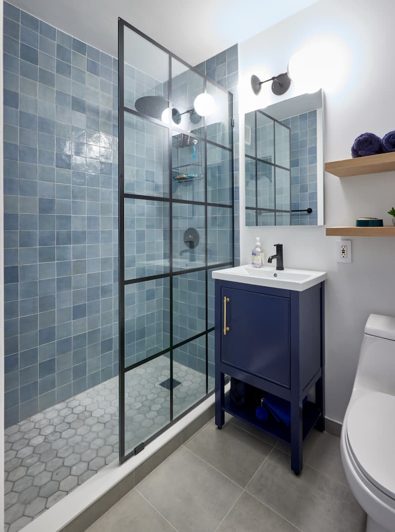
Bathroom: Light-colored tiles amplify natural and artificial brightness, crucial for morning routines and the feeling of cleanliness. Whites, pale grays, or soft blue shades help bathrooms feel spa-like. Choose mid-tones for slip-resistance and contrast, especially in family baths. They also reveal fewer water spots and are gentler on aging eyes.
Living room: Social hubs like living rooms are best served by warm, neutral, or wood-look floors that encourage comfort and entertain a variety of styles. Larger spaces can handle darker tones without feeling cold, while lighter shades help small or dim rooms feel peaceful. Rugs add flexibility and softness.
Bedroom: Bedrooms thrive on restful, warming tile colors—think taupe, light brown, or warm gray. Coordinate tile with bedding and furniture; matte finishes help minimize glare and set a tranquil tone.
Entryway and hallway: High-traffic entranceways call for medium-toned, tough-wearing tiles, or subtle patterns that hide scuffs and dirt. Textured or naturally variegated tiles are practical, and thoughtful color transitions keep your home feeling cohesive.
Renovate with confidence every step of the way
Step 1: Personalize Your Renovation Plan
Step 2: Receive Quotes from Trusted Contractors
Step 3: Let Us Handle the Project Details

The relationship between floor and wall color is everything for visual balance. Floors serve as the anchor, while wall colors set the stage for everything else.
Light floors with light walls keep rooms fresh and breezy, while dark walls introduce contrast and modern drama. Medium floors fit best with soft or off-white walls, neutralizing the space and providing easy transition between open areas.
Dark floors pop with light walls, enhancing the richness of the tile and preventing rooms from closing in. When mixing undertones, keep warm with warm and cool with cool for visual unity.
Your floor tile color isn’t just an aesthetic decision—it plays a crucial role in how easy your floors are to live with every day. The best color for you will depend on the unique needs of your household.
Families with children and pets: Choose medium-toned or subtly patterned tiles that easily hide dirt, pet hair, and scuffs from busy feet and paws. These tiles are forgiving on a day-to-day basis, reducing the pressure to clean constantly and helping your floors look fresh longer, even between deep cleans. For more insights, read our guide to pet-friendly flooring.
Older adults or those with limited eyesight: When searching for senior-friendly flooring, opt for mid-tone colors that gently contrast with the walls. These shades make it easier to distinguish floor boundaries, reducing trip hazards and supporting safer navigation. Softer neutrals also create a more comfortable and inviting environment, especially when paired with matte finishes that minimize glare.
Homes prioritizing easy upkeep: Steer clear of very light tiles, which show stains and footprints easily, or very dark tiles, which highlight dust and water spots. Instead, tiles in the mid-range—especially those with variation or texture—will require less frequent upkeep and better camouflage the signs of daily life.

Grout might seem like a side note, but it’s a key part of your floor’s finished look. The right grout color can completely transform the tiles themselves.
Matching grout to tile blurs lines, enlarges the visual field, and minimizes maintenance headaches.
Contrast grout highlights tile shape and pattern, celebrating layouts like herringbone or chevron.
Mid-tone grout strikes a balance, camouflaging stains without stealing the show.
Light grout is prone to staining in busy areas, while very dark grout can fade or leave residue—choose mindfully for your lifestyle.

One advantage of modern remodeling is access to visualization tools like Renovation Studio—an intuitive free platform that allows you to explore combinations of floor and wall colors, materials, and layouts before making a final decision. Test how light, medium, or dark tile looks with different cabinets or wall colors and see every option in the context of your unique space, day or night.
With visualization platforms, you can confidently mix and match sample tiles, fixture colors, and finishes, ensuring your selection looks beautiful in real life—not just in your imagination.
Don’t rely just on screens or showrooms—test your tile options at home before making the final call.
Bring samples home and look at them throughout the day, in sunlight and artificial light.
Arrange samples near the cabinetry, furniture, and painted walls to evaluate harmony.
Walk on sample tiles and observe them from different angles and distances.
Notice how samples look clean and with a little dust—real life matters!
Consider the grout color in your mockups for maximum accuracy.
Giving yourself time to review samples ensures peace of mind and a finished look you’ll truly love.
When you work with Block Renovation, the journey to the best floor tile color becomes streamlined, inspired, and supported at every step. Our process guides you through each important decision—from choosing base colors and finishes, to visualizing tile and grout in context, all the way through installation. Our Renovation Studio platform empowers you to freely experiment and eliminates second-guessing. Our experienced designers partner with you every step of the way, transforming your vision into a durable, liveable, and timeless space.
Remodel with confidence through Block

Connect to vetted local contractors
We only work with top-tier, thoroughly vetted contractors

Get expert guidance
Our project planners offer expert advice, scope review, and ongoing support as needed
Enjoy peace of mind throughout your renovation
Secure payment system puts you in control and protects your remodel

Renovate confidently with Block
Easily compare quotes from top quality contractors, and get peace of mind with warranty & price protections.
Flooring
Best Engineered Wood Flooring Brands (2026 Real Reviews)
05.25.2026

Flooring
Wide Plank vs Narrow Plank Flooring: Cost & Impact
05.19.2026

Flooring
Subfloor Replacement Costs and Processes
05.15.2026
.webp?width=640&name=u5821215421_Three-quarter_angle_view_where_70_of_the_frame_is_6ec560a5-707c-4e76-b31c-a0fdeb867a6d_0%20(1).webp)
Flooring
Allergy-Proofing Your Home Remodel: Flooring & Other Choices
04.25.2026

Flooring
Best Flooring for Wheelchairs and Walkers | Block Renovation
04.16.2026