
Cabinets
Brown Cabinets With White Countertops: Design Guide
06.04.2026
03.19.2026
.jpg?width=640&name=2bd1b82f-617c-4494-84e2-63d1ac0f87f8%20(1).jpg)
In This Article
If there's one kitchen design move that offers maximum visual impact with minimal structural change, it's two-tone cabinets. By using two different colors, finishes, or materials across your upper and lower cabinets—or between your perimeter cabinets and island—you can create depth, personality, and a sense of intention that a single-color kitchen simply can't match. Whether your style leans bold and playful or quiet and refined, two-tone cabinets are one of the most versatile ways to make your kitchen feel unmistakably yours.
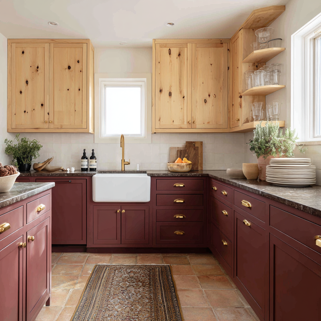
Raw, knotty wood uppers bring warmth and texture that painted cabinets simply can't replicate—and when they're paired with a rich, saturated lower, the result is a kitchen that feels layered and lived-in. Here, deep wine-colored base cabinets anchor the space while light pine uppers keep things from feeling heavy. Gold cup pulls and a farmhouse sink bridge the two tones beautifully. This combination works especially well in kitchens where you want to honor natural materials without sacrificing color—the wood uppers let you go bolder below without the palette tipping into darkness. For more two-tone inspiration along these lines, check out our guide to combining painted and wood cabinets.
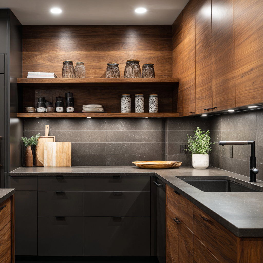
Two-tone doesn't have to mean two contrasting colors. In this moody kitchen, matte charcoal flat-panel base cabinets sit beneath walnut upper cabinets and open shelving, creating a tonal contrast that's all about texture and material rather than color. The combination of stone-finish tile, concrete-look countertops, and matte black hardware reinforces the palette's depth without introducing any new hues. This approach is ideal for homeowners who want a sophisticated, dramatic look that feels cohesive rather than busy.
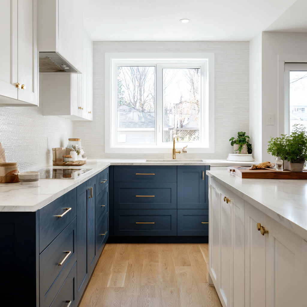
One of the most popular applications of two-tone cabinetry is differentiating the island from the perimeter cabinets. Here, inky navy base and upper cabinets line the walls while a crisp white island stands apart—creating a clear visual anchor for the kitchen's work zone. Brass hardware and marble-look countertops warm up the contrast. This approach works beautifully in kitchens with a dedicated island because it gives the island its own identity, making the layout feel more intentional and the space more dynamic.

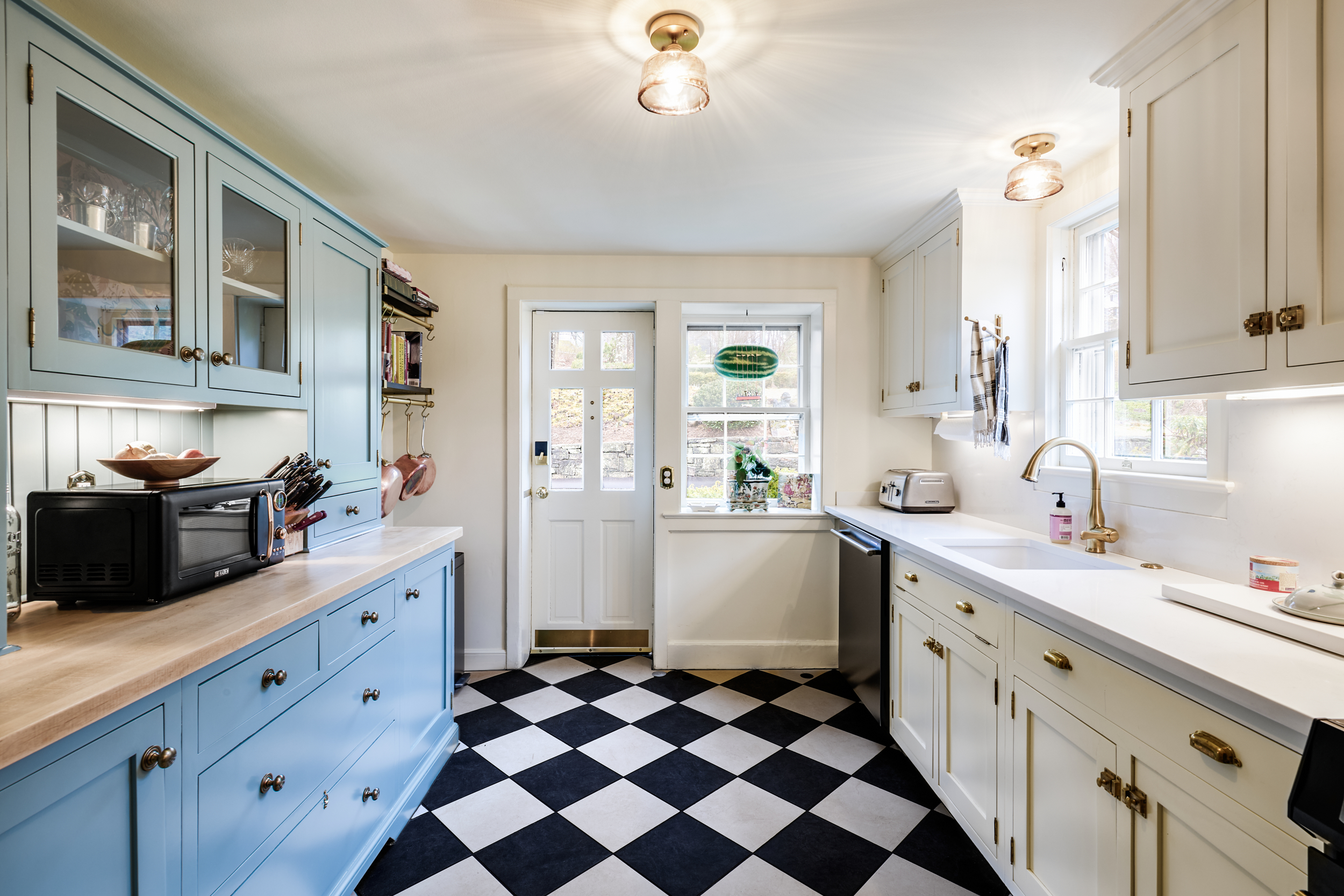
Two-tone cabinets aren't just a style choice—they can also do practical work by visually defining different areas of your kitchen. Here, light blue cabinets on one side and white on the other naturally separate the space into distinct zones, giving the kitchen a sense of organization and intention without any structural changes. A checkerboard floor anchors the whole room and keeps the look feeling cohesive rather than divided. If your kitchen has a natural break in the layout—a corner, a peninsula, or a shift from cooking space to storage—color is one of the simplest ways to acknowledge and celebrate that separation.
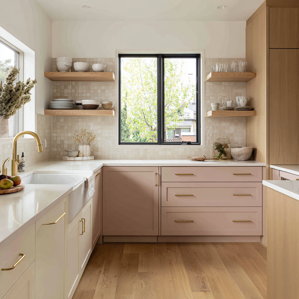
Not every two-tone kitchen needs to make a statement. Sometimes the most beautiful results come from pairings that are almost-but-not-quite the same—a soft blush below, a warm white above, with natural oak floating shelves tying them together. This kitchen leans into a warm, airy palette that feels both fresh and inviting. Zellige-style backsplash tile and a farmhouse sink add texture without competing with the cabinets. If your goal is a kitchen that feels calm and personal rather than high-contrast, a tonal two-tone palette like this is a great direction to explore.
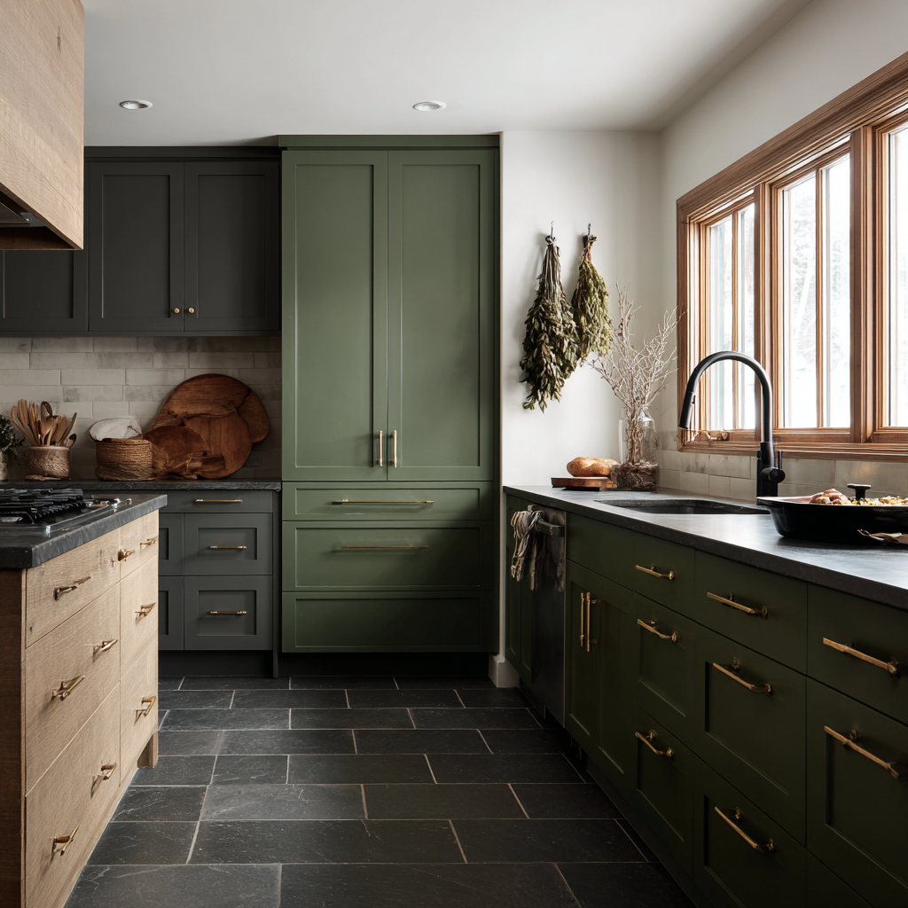
Two-tone cabinets get all the attention, but if you have a larger kitchen with enough visual real estate to work with, a third tone can take the design even further. Here, forest green and deep charcoal cabinets share the space with natural wood accents—three distinct elements that each pull their own weight without competing.
Brass hardware and slate tile flooring tie everything together, and the result feels layered and considered rather than busy. The key to making three tones work is keeping at least one of them a natural material, like wood or stone, which acts as a bridge between the other two. This approach works particularly well in homes with natural wood floors or exposed beams, where the cabinetry can echo materials already present in the space.
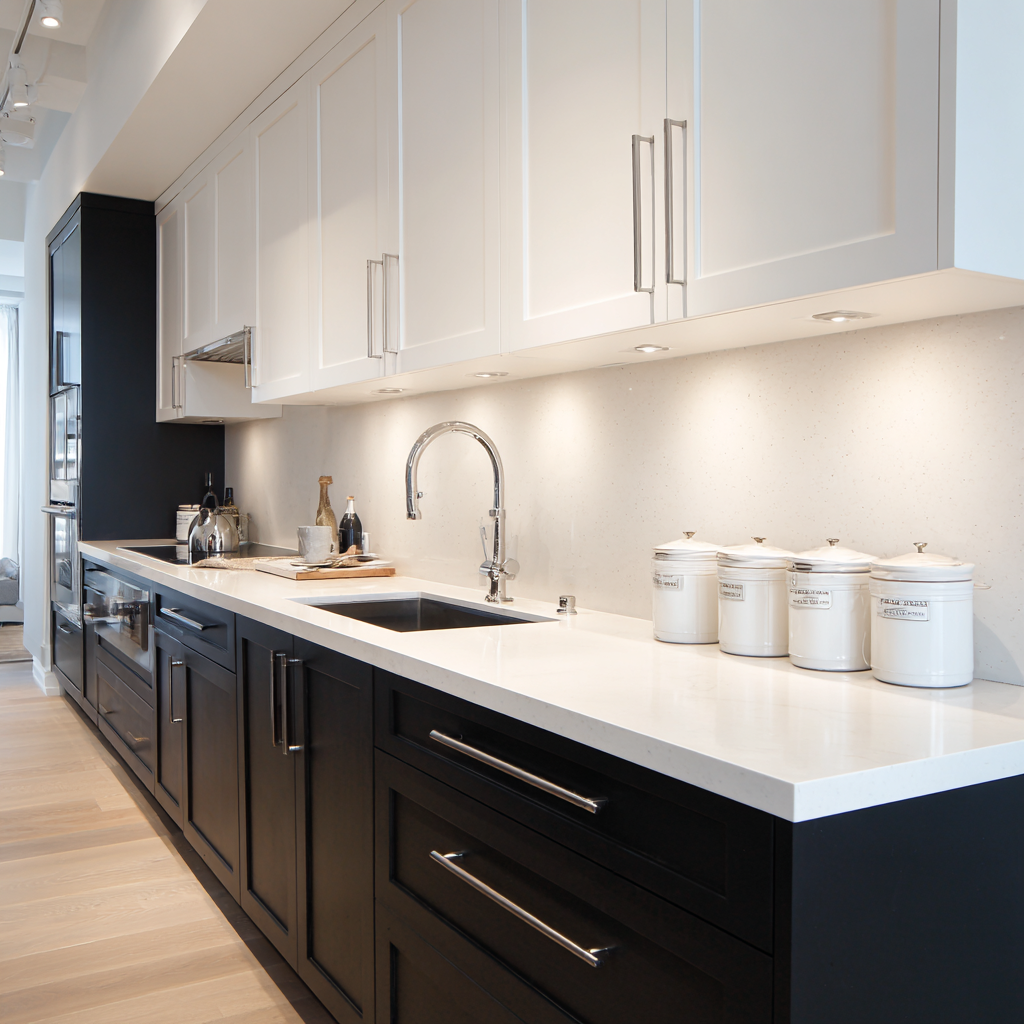
Dark lower cabinets with light uppers is the most classic two-tone arrangement—and it's enduringly popular because it works. Visually, it anchors the lower portion of the kitchen, making the ceiling feel higher and the space feel more open. In this contemporary galley kitchen, matte black lowers meet crisp white uppers with a seamless, speckled quartz backsplash running the full length of the wall. The result is clean, confident, and easy to live with. Chrome hardware and under-cabinet lighting keep the look polished without adding visual clutter.

Sometimes the most sophisticated two-tone kitchens aren't the ones with the highest contrast—they're the ones where you have to look twice to notice the difference. This Block customer kitchen uses a cool, minimal palette where upper and lower cabinets are closely matched in tone, creating a breezy, almost monochromatic feel with just enough variation to add visual interest. This approach requires more restraint in execution, but the payoff is a kitchen that feels effortlessly considered. If you love the idea of two-tone cabinets but don't want the contrast to dominate your space, start here.
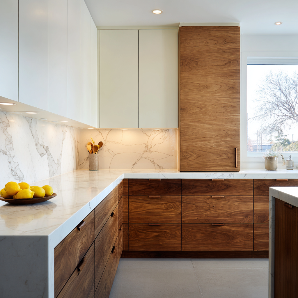
Pairing crisp white or off-white upper cabinets with warm, rich wood lowers is one of the most elegant expressions of two-tone cabinetry. In this airy, sun-filled kitchen, flat-panel walnut base cabinets and a floor-to-ceiling walnut pantry wall anchor the space, while white upper cabinets and a full-height marble backsplash keep things luminous and light. The material contrast between the veined stone and the warm wood grain creates a level of visual richness that paint alone couldn't achieve. This combination works especially well in modern and transitional kitchens where you want warmth without sacrificing brightness.
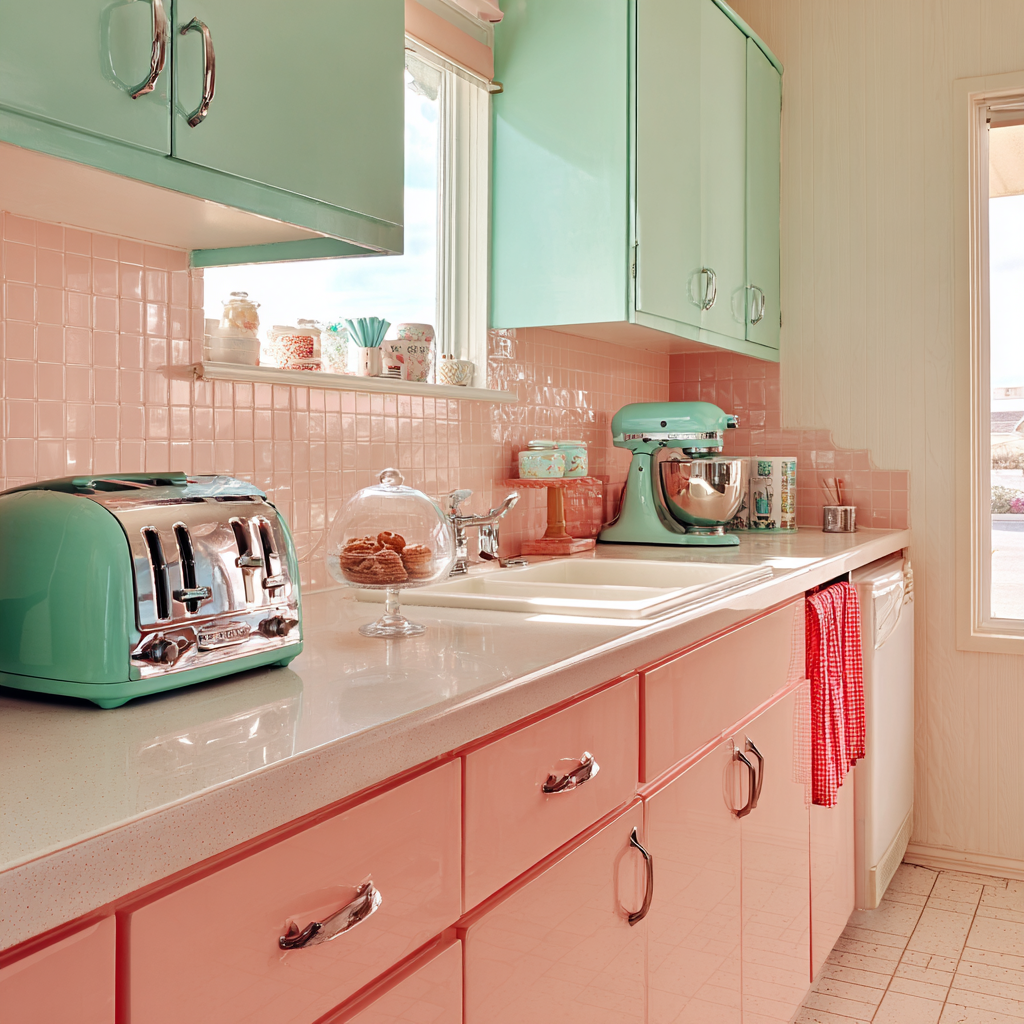
Committing to a statement color can feel risky—but two-tone cabinets are actually one of the best ways to make it work. By pairing a bold hue with a more grounding tone, you give the eye somewhere to rest, and the bold color gets to shine without overwhelming the space. In this retro-inspired kitchen, coral pink lowers meet mint green uppers in a pairing that feels joyful and considered. The chrome hardware and matching appliances tie both tones together and reinforce the intentionality of the palette. If you're drawn to a color that feels a little daring, letting it anchor the lower half of your kitchen—where it reads as grounded rather than all-consuming—is a great strategy.
Design a Home That’s Uniquely Yours
Block can help you achieve your renovation goals and bring your dream remodel to life with price assurance and expert support.
Get Started
Two-tone cabinets are one of the most impactful, personal choices you can make in a kitchen renovation—and getting the pairing, proportion, and execution right makes all the difference. Step one? Use our free Renovation Studio to visualize how different cabinets could look in your home.
Once you’re ready, Block Renovation connects homeowners with thoroughly vetted, experienced contractors who understand the nuances of a well-crafted kitchen. Plus, we offer homeowners resources like progress-based payment systems, optional design services, and free access to a designated Planner to help you feel confident in every decision you make.
Remodel with confidence through Block
Connect to vetted local contractors
We only work with top-tier, thoroughly vetted contractors

Get expert guidance
Our project planners offer expert advice, scope review, and ongoing support as needed
Enjoy peace of mind throughout your renovation
Secure payment system puts you in control and protects your remodel

Renovate confidently with Block
Easily compare quotes from top quality contractors, and get peace of mind with warranty & price protections.
Cabinets
Brown Cabinets With White Countertops: Design Guide
06.04.2026
.webp?width=640&name=u5821215421_Three-quarter_angle_view_where_70_of_the_frame_is_6ec560a5-707c-4e76-b31c-a0fdeb867a6d_0%20(2).webp)
Cabinets
Extending Kitchen Cabinets to the Ceiling: Before & After
05.25.2026

Cabinets
Refacing vs. Replacing Cabinets - 2026 Costs
05.08.2026
Cabinets
Two-Tone Kitchen Cabinet Ideas to Inspire Your Renovation
03.19.2026

Cabinets
2026 Kitchen Cabinet Trends: Colors, Hardware, and More
03.02.2026