
Backsplash
Rustic Backsplash Ideas That Survive a Real Kitchen
06.17.2026
04.17.2026

In This Article
Let's be honest: gray cabinets are a little boring on their own. That's not a flaw, as neutrality is the point. But it does mean that the backsplash and countertops carry the room. They're not supporting players. They're doing most of the work.
It's also worth saying upfront that gray cabinets don't work for every kind of home. Farmhouse, craftsman, and spaces that lean heavily on natural wood and earthy tones tend to feel flat or even cold with gray cabinetry. Gray earns its place in modern, transitional, and industrial spaces where its restraint reads as intentional. In the wrong context, it just reads as unfinished.
In the right kitchen, though, gray gives you more backsplash freedom than almost any other cabinet color. It holds up against bold pattern, doesn't compete with saturated color, and gets out of the way when the material wants to speak for itself. The eleven directions below represent very different design philosophies. Most of them work specifically because of gray, not in spite of it.
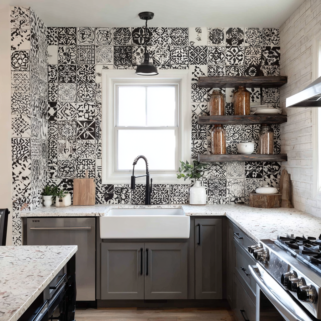
The most common mistake with bold tile is trying to manage it. Homeowners choose a busy pattern and then pull back on everything else in the kitchen—white countertops, simple fixtures, no color anywhere—hoping the restraint will keep things from tipping over. It usually results in a kitchen that feels timid rather than deliberate.
The better move is to let the pattern be loud and choose a cabinet color that simply doesn't react to it. Gray does this better than white, which washes out beside heavy pattern, and better than wood, which adds its own visual texture and competes. Gray is inert in the best possible sense. A patchwork of black and white encaustic tiles with different geometric motifs on every face can run at full volume because the cabinet color underneath it isn't pushing back. The palette stays achromatic throughout. The pattern gets to be the whole point.
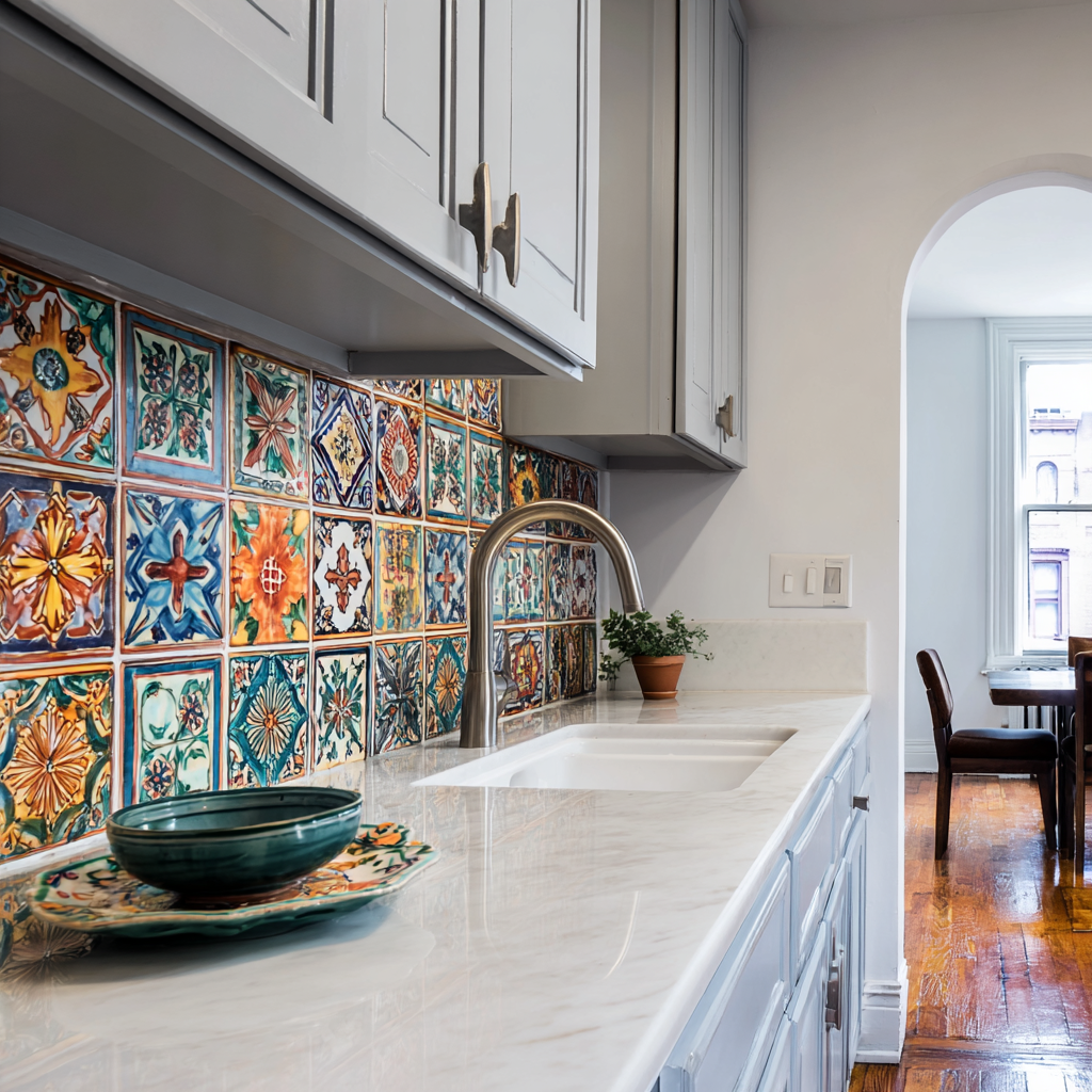
Gray is the only cabinet color that lets genuinely multicolored tile read as designed rather than chaotic.
When a backsplash carries cobalt blue, terracotta orange, forest green, and saffron yellow across handpainted tiles where no two are alike, the kitchen needs something steady around it. White cabinets disappear. Warm wood cabinets add another color into the mix and start fighting the terracotta. Gray holds its position without contributing to the noise, which is exactly what a backsplash this busy requires. The grout choice matters too: a warm putty or gray grout ties the tile and cabinet into the same tonal conversation rather than adding a fourth element to manage.
If there is a backsplash choice that homeowners consistently talk themselves out of and later regret, this is it.
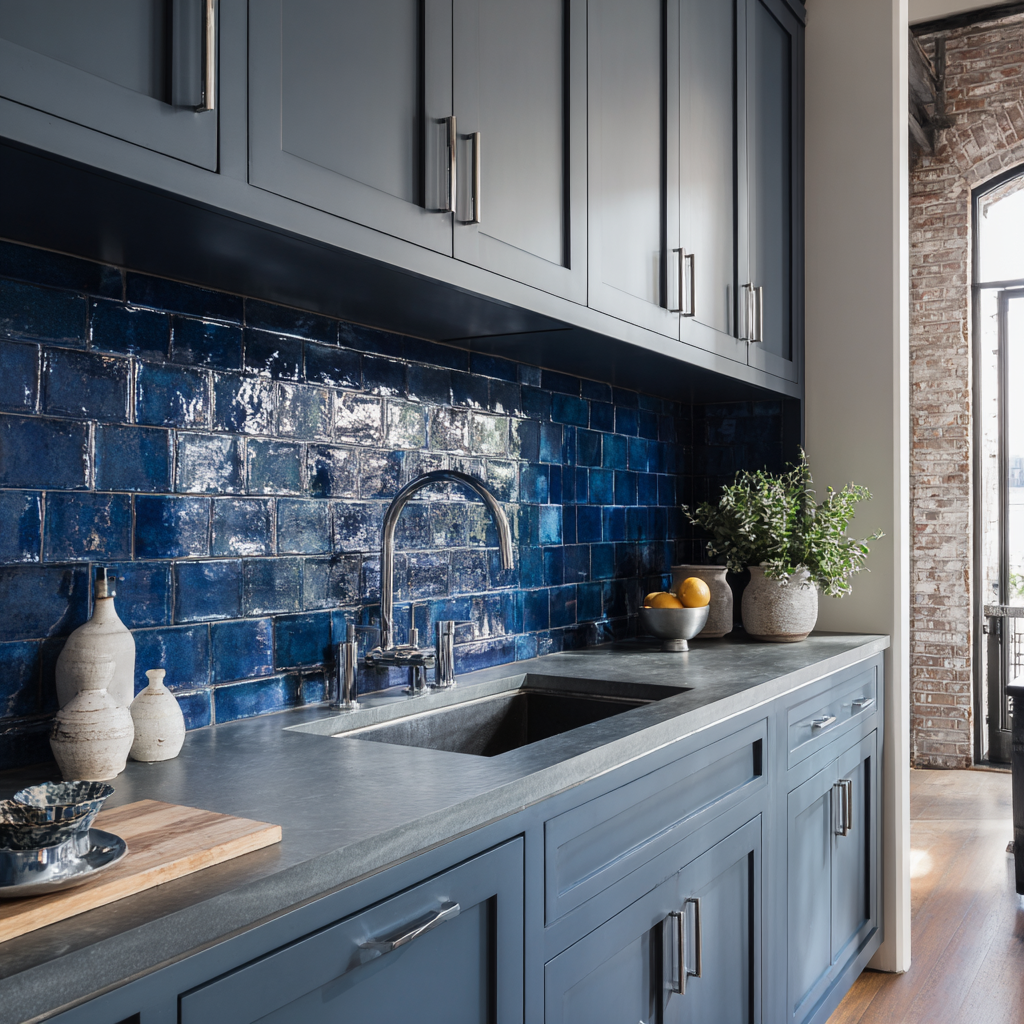
What makes saturated single-color tile work is contrast of intensity, not contrast of color. Gray and navy don't clash. They share a cool undertone. But one of them is doing almost nothing visually and the other is doing everything, and that imbalance is where the interest comes from.
What makes this work in practice rather than just in theory is surface variation. Factory tiles in a flat, uniform navy read as commercial. Handmade glazed tiles, where the glaze shifts from deep blue to near-black at the pressed edges of each piece, give the backsplash genuine depth and movement. Against the flatness of painted cabinet fronts, that variation is the difference between a backsplash that looks installed and one that looks chosen.
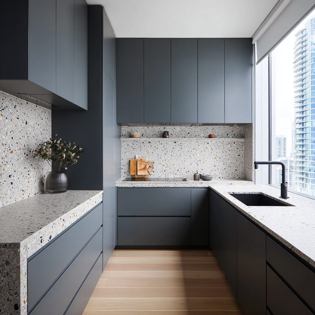
The design problem terrazzo solves is monotony without loudness. Dark gray cabinets in a modern kitchen can start to feel heavy, particularly in smaller spaces or rooms without much natural light. The instinct is to introduce a contrasting color in the backsplash. The better move is usually to introduce a contrasting surface.
Terrazzo, with its speckled aggregate of white, black, warm gray, and occasional amber or gold chips, breaks up the visual weight of dark cabinetry without asking for attention the way a colored tile would. Run it as a continuous slab across both backsplash and countertop and it becomes the room's defining material rather than a secondary finish. The pattern is inherent to the material. Nothing needs to be designed.
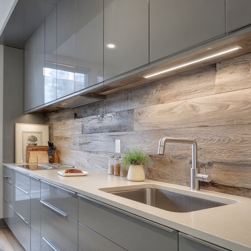
Organic materials are the fastest corrective for a gray kitchen that reads as cold. Gray is inherently cool, and in a north-facing room or a kitchen without much natural light, that coolness can tip into something that feels clinical. The backsplash is where you fix it.
Reclaimed wood backsplash planks introduce grain, warmth, and the kind of surface variation that no manufactured material can replicate. Think of it as material opposition: the backsplash should be the opposite of the cabinet in every quality except scale. Where the cabinet is smooth, the wood is rough. Where the gray cabinets are cool, the wood is warm. Where the cabinet is uniform, the wood is varied. That opposition is what gives the kitchen its character.
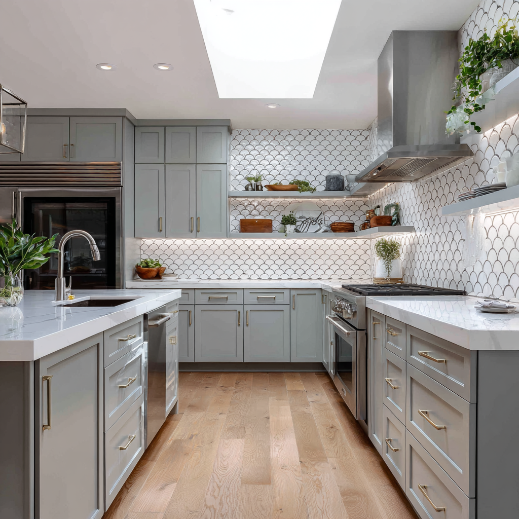
Shape is the most underused variable in backsplash design, and it's particularly effective behind gray cabinets because gray gives the geometry nowhere to hide. Scallop tile, also called fish scale or fan tile, lays overlapping arcs across the wall surface that catch light at slightly different angles—each one a degree or two off from the next—creating movement and depth without any color doing the work. Keep the tile in white or warm cream and the overall palette stays completely calm while the surface itself stays interesting. Pattern doesn't require pigment. It's a way to have a considered backsplash without committing to a color, which is exactly the kind of decision gray cabinets make possible.
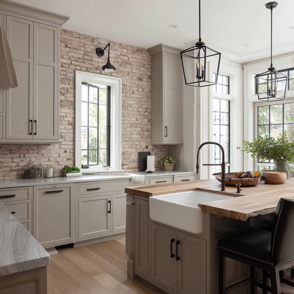
Run your hand across a lime-washed brick backsplash and you'll understand immediately why it works behind gray cabinets. The mortar joints are slightly recessed. The bricks vary from one to the next. The surface has the kind of handmade irregularity that manufactured tile spends a lot of money trying to fake. Now look at the cabinet fronts beside it: smooth, flat, uniform. That contrast is the whole idea. A flat surface and a textured surface will always read as more interesting together than two flat surfaces, and painted cabinetry is about as flat as a kitchen surface gets. Gray is the right cabinet color for this specifically because it doesn't compete with the warmth that even white-painted brick carries. A richer, deeper cabinet color would fight it. Gray steps back and lets the wall be the wall.
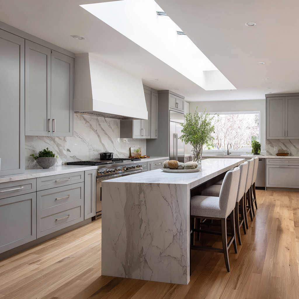
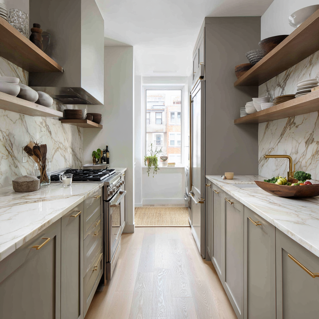
What makes marble and gray work together is tonal alignment. Both materials sit in the cool, neutral part of the color spectrum. Both are associated with restraint. Pairing them works because neither is asking to be looked at, which means the veining in the stone, which is inherently dramatic, gets to do all the work without competition.
The finish is where most marble installations go wrong. Polished marble behind gray cabinets reads as formal and slightly cold. Honed marble, with its matte surface, brings the stone into the same register as the painted cabinetry and makes the overall effect feel resolved rather than precious. A slab rather than individual tiles eliminates grout lines and lets the veining read as a continuous composition. That continuity is what separates a marble backsplash that looks like a design decision from one that looks like a standard upgrade.
Standard backsplash height puts marble in a supporting role. Taking the same material from countertop to ceiling changes its function entirely.
At full height, marble stops being a finish and becomes architecture. The veining, which at standard backsplash height is a detail, becomes a pattern that organizes the entire wall. Warm-toned Calacatta marble with amber and gold veining is particularly effective in gray kitchens because it introduces the organic warmth that cool cabinetry often lacks. Brass hardware extends those warm tones down through the cabinet line, connecting the stone and the cabinetry into a single visual argument. The material commitment is significant. That's the point.
A limewash backsplash looks different at seven in the morning than it does at noon, and different again under artificial light in the evening. That quality—a surface that shifts tone depending on the angle and the light—is what makes it worth considering behind gray cabinets, and it's also what makes it difficult to pull off. This is surface contrast within a narrow palette, which is a harder design move than it sounds. The colors between the plaster and the cabinetry are close. The surfaces are not.
The hand-applied, slightly uneven texture of the plaster against the flatness of painted cabinet fronts creates depth through finish rather than through color, which is a quieter effect and a more sophisticated one. In open-plan kitchens where the backsplash wall reads from the living room, it helps the kitchen feel like part of the larger space rather than a room with its own visual agenda. Getting there requires confidence in the subtlety. Most people don't have it, which is why this combination is done poorly far more often than it's done well.
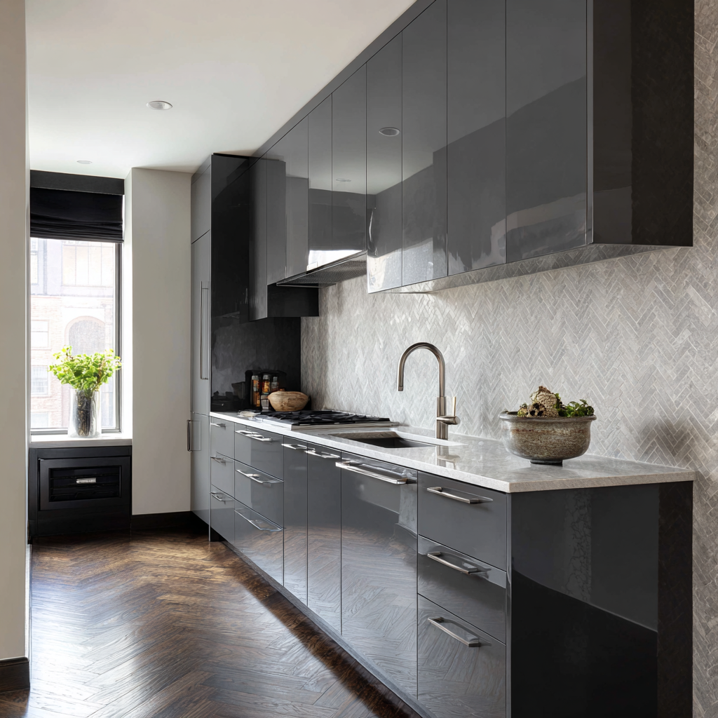
High-gloss gray lacquer cabinet fronts are already doing a significant amount of visual work. The reflective surface catches light, creates movement, and produces depth without any help. The design error is choosing a backsplash that adds more of the same qualities.
It comes down to opposition of finish. A matte or honed stone backsplash in a directional pattern, herringbone being the most reliable, introduces texture and light absorption where the cabinet is offering reflection. The eye moves between the two surfaces and finds both of them interesting because they're doing different things. Pair high-gloss cabinets with a high-gloss backsplash and both surfaces compete for the same kind of attention. The kitchen ends up feeling like a showroom. The fix is to let the cabinets be shiny and let the backsplash be something else entirely.
Design a Home That’s Uniquely Yours
Block can help you achieve your renovation goals and bring your dream remodel to life with price assurance and expert support.
Get Started
One of the hardest parts of choosing a backsplash is making a decision from a four-inch sample tile on a showroom counter. The scale is wrong, the light is wrong, and the gray cabinet color standing next to it is almost certainly not yours.
Block's Renovation Studio lets you work through exactly these decisions in your actual space. Upload your kitchen dimensions, select your cabinet color, and test backsplash materials and finishes against each other in a rendered view that reflects how the combination will actually look. Change the tile, change the countertop, change the grout color, and watch the cost estimate update in real time as you go.
The backsplash decision is bigger than most people treat it during the planning process. Material samples in a showroom under fluorescent light bear almost no resemblance to what those same materials look like installed in your actual kitchen, in your actual light, behind your actual cabinet color. The only way to know is to get large samples into the space before you commit.
Block Renovation matches homeowners with vetted contractors who have installed all of the above and who can tell you, based on your specific kitchen and your specific shade of gray, which options will actually perform the way you're imagining them. That kind of guidance is worth getting before the tile is ordered, not after.
Remodel with confidence through Block
Connect to vetted local contractors
We only work with top-tier, thoroughly vetted contractors

Get expert guidance
Our project planners offer expert advice, scope review, and ongoing support as needed
Enjoy peace of mind throughout your renovation
Secure payment system puts you in control and protects your remodel

Renovate confidently with Block
Easily compare quotes from top quality contractors, and get peace of mind with warranty & price protections.
Backsplash
Rustic Backsplash Ideas That Survive a Real Kitchen
06.17.2026

Cabinets
Brown Cabinets With White Countertops: Design Guide
06.04.2026

Paint & Color
Wall Colors for Light Wood Floors: Grays, Whites & More
05.13.2026

Paint & Color
Gray Walls with Dark Hardwood Floors: Pull Off the Look
05.06.2026
.png?width=640&name=Moody%20Dining%20Room%20Painted%20Ceiling%20Walls%20(2).png)
Paint & Color
Painting Ceilings the Same Colors as the Walls: Pros & Cons
04.22.2026