




Before and After
Kitchen Island Remodel: Before and After Inspo
06.26.2026
05.29.2026


In This Article
The 1970s left behind a particular kind of kitchen that millions of American homes still have today. The cabinets are usually orange-toned oak or dark walnut veneer with curved edges. The countertops were laminate in beige or brown patterns meant to imitate stone. Floors came as vinyl tile in abstract prints or as ceramic with grout the color of a paper bag. A single fluorescent box on the ceiling did most of the lighting work, and the appliances arrived in harvest gold, avocado green, or coppertone brown.
A 1970s kitchen was usually built to last. The cabinet boxes are full plywood with solid shelf supports, and many of them have outlasted three rounds of appliances. What dates a 1970s kitchen is almost always the surface, not the structure underneath.
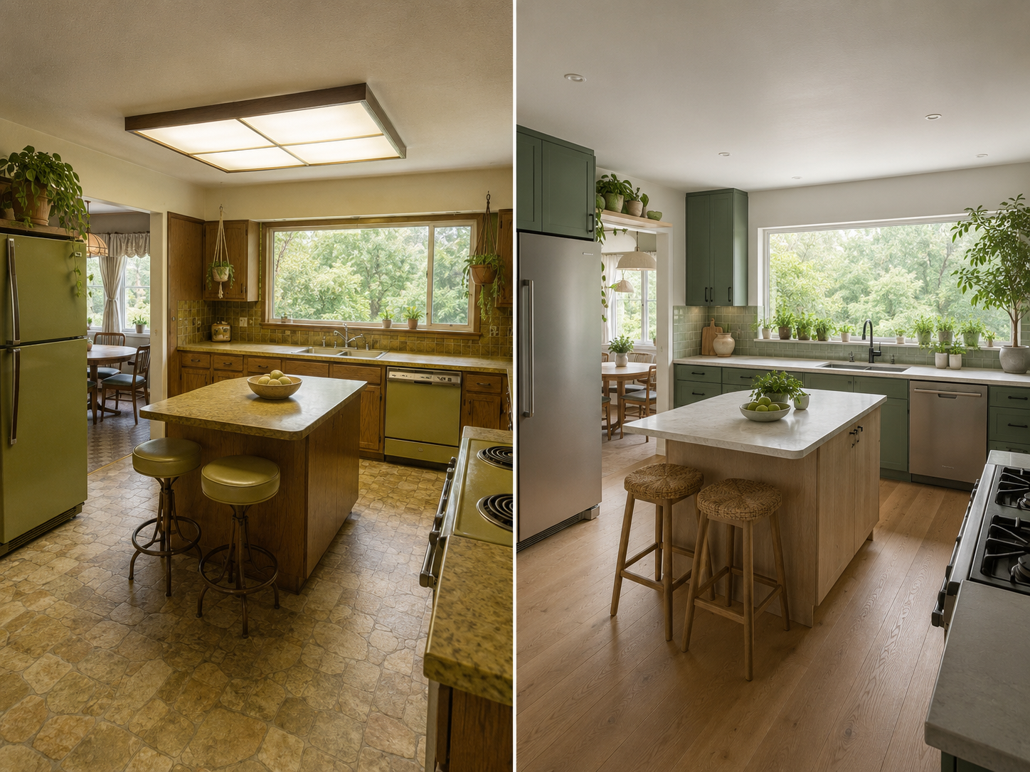
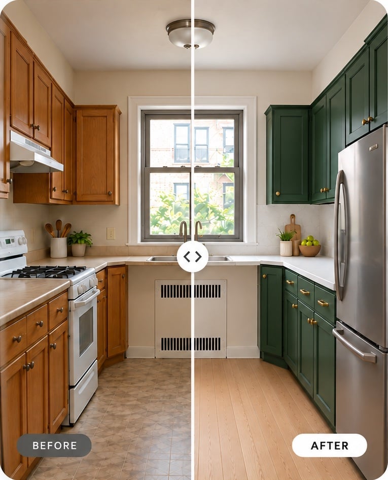
The plants are doing real work in this direction. A wide picture window doubles the natural light coming into the room, sage green Shaker cabinets calm everything around them, and the windowsill becomes a plant shelf.
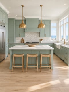
A muted sage or olive acts the way warm gray does, steadying whatever sits next to it. Pair it with light wood floors, white counters, and brass hardware, and the green disappears into the palette.
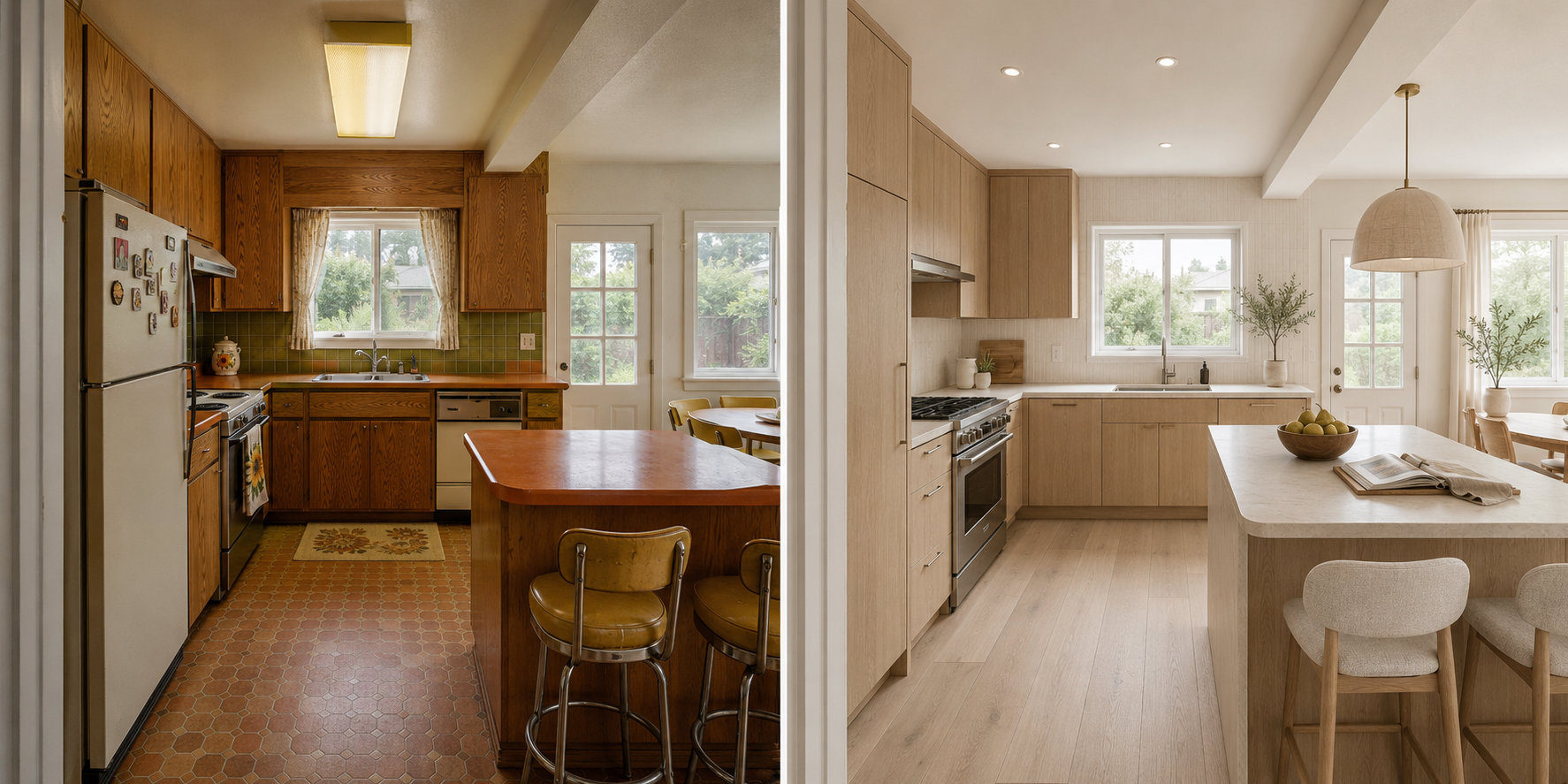
A 1970s kitchen often gets misdiagnosed. The problem is rarely the style. The problem is the color temperature, where orange-toned oak, orange laminate, hexagonal terracotta floors, and a yellow fluorescent box overhead all sit in the same warm middle band, and the room reads busy with nothing on the counters.
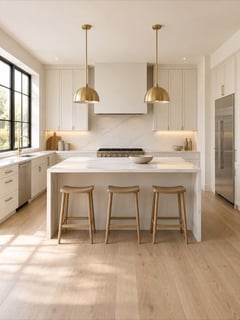
A Scandinavian direction fixes this by pulling everything cooler. Rift-cut oak replaces the orange oak, white oak flooring goes in over the terracotta, and a pale linen pendant takes the place of the fluorescent box.
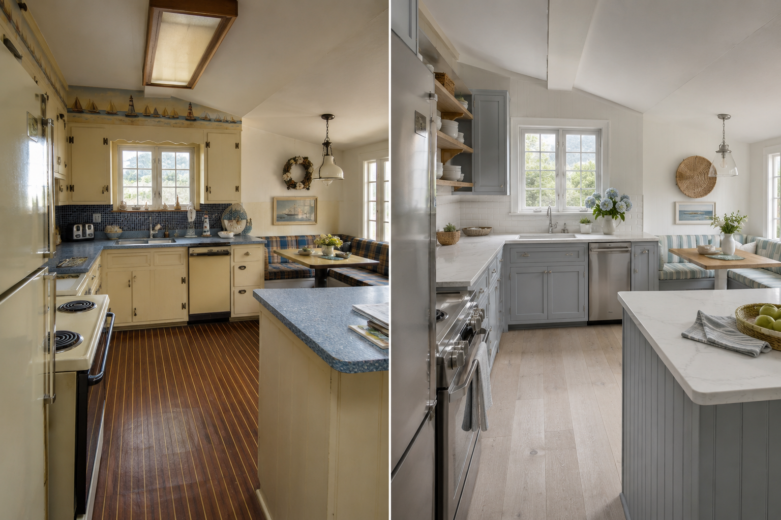
Older kitchens almost always waste corner space. A freestanding breakfast table cannot reach into a corner cleanly, and the result is a dead zone of floor against two walls.
A built-in banquette claims that corner back. Storage tucks underneath, and the room gains a designated eating spot without losing prep area. Painted blue-gray Shaker cabinets, white walls, and natural wood floors keep the corner from feeling boxed in.
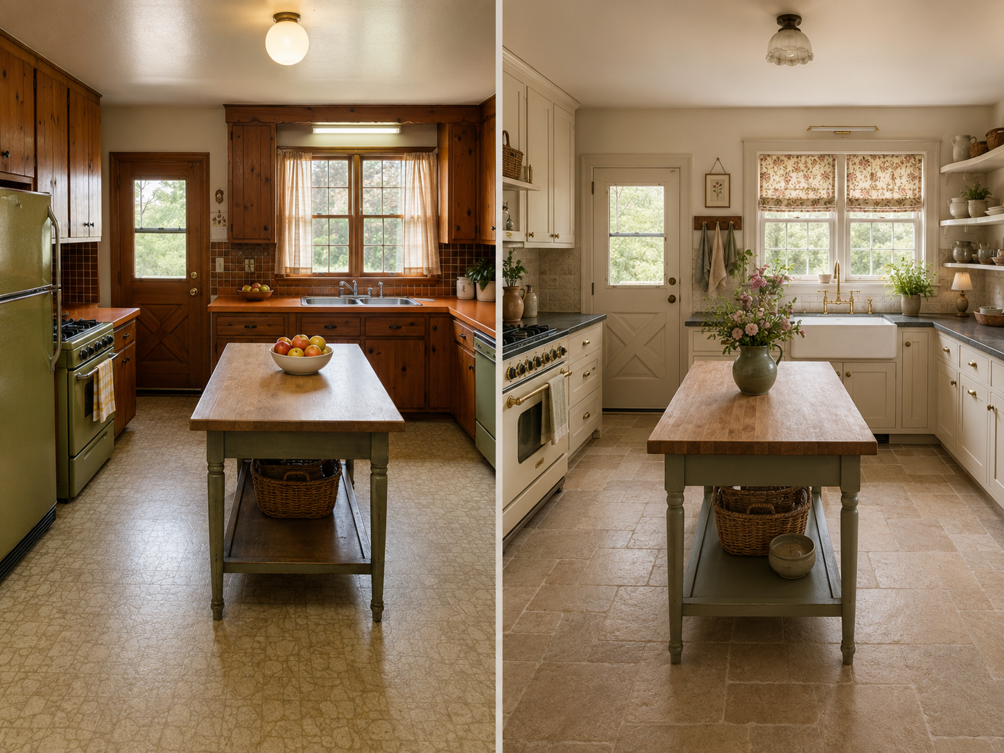
Cottagecore and farmhouse get confused with country kitsch more often than not. The actual ingredients are softer.
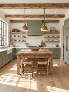
The look is built on layered textiles, painted woodwork, hand-thrown pottery, and freestanding furniture. Cream cabinetry takes the place of knotty pine. A floral Roman shade drops in the window. An apron sink replaces the stainless drop-in. A sage-painted prep table with a butcher block top sits in the middle of the room. None of those choices is twee on its own.
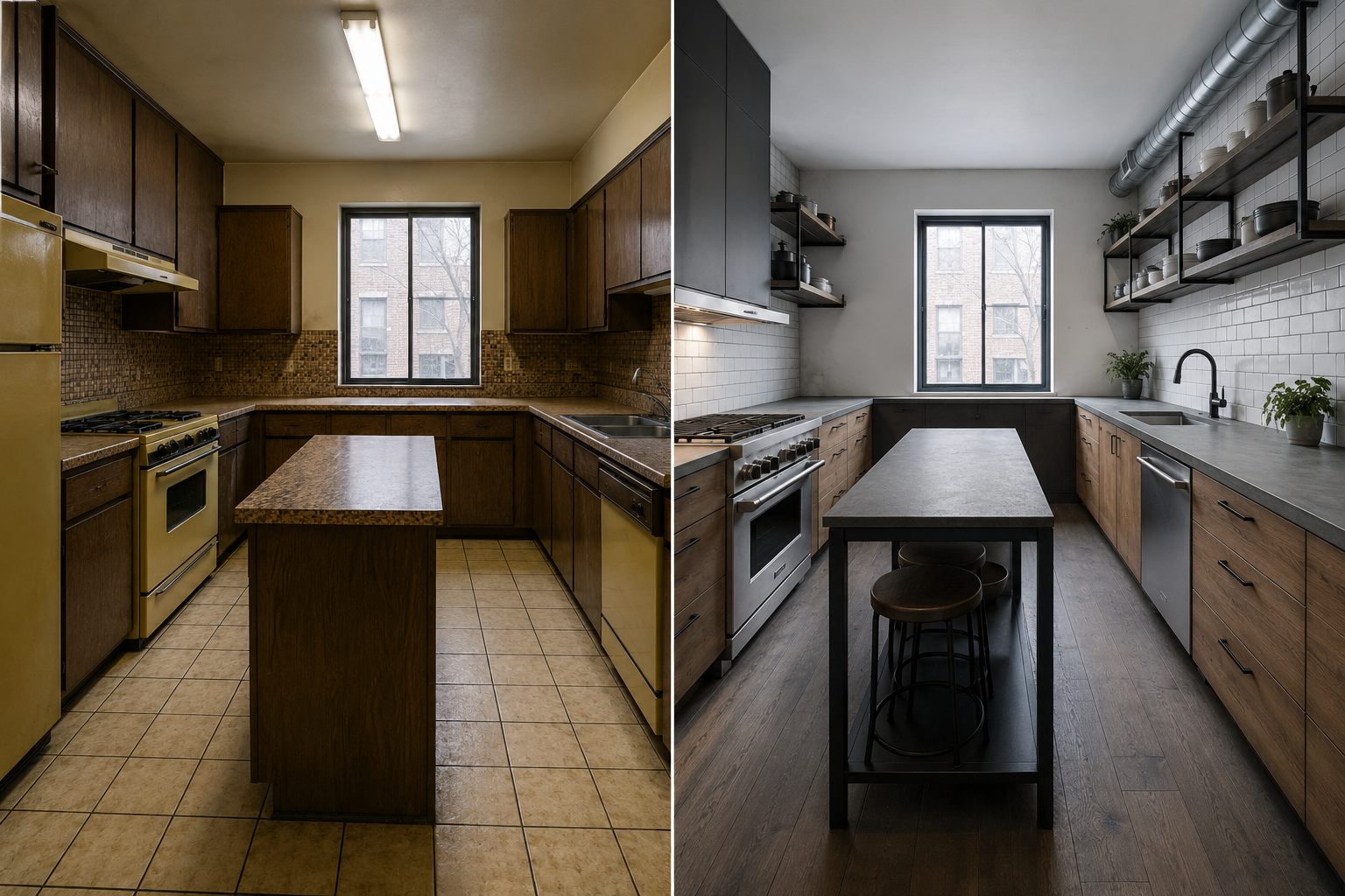
Exposed ductwork either looks intentional or it looks like the contractor ran out of budget for soffits. The difference is whether the ducts were sized, routed, and finished as part of the design, not left raw because finishing them felt expensive.
Open shelving follows the same rule. Dishes need to look intentional every day. Subway tile across the back wall, dark plank floors, and black metal shelving frames give the industrial direction enough hard structure to carry the look.
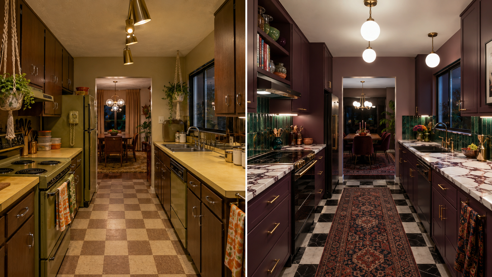
In a maximalist kitchen, every color has to sit at the same saturation. A deep emerald cabinet next to a dusty pink wall looks uncertain, because one color has more visual weight than the other.
A single saturation level across the room solves the problem. Aubergine cabinets, glossy emerald tile, pink-and-white marble counters, and brass fixtures all share roughly equal depth, so each color holds its place. Patterned runners on tile soften the hard surfaces.
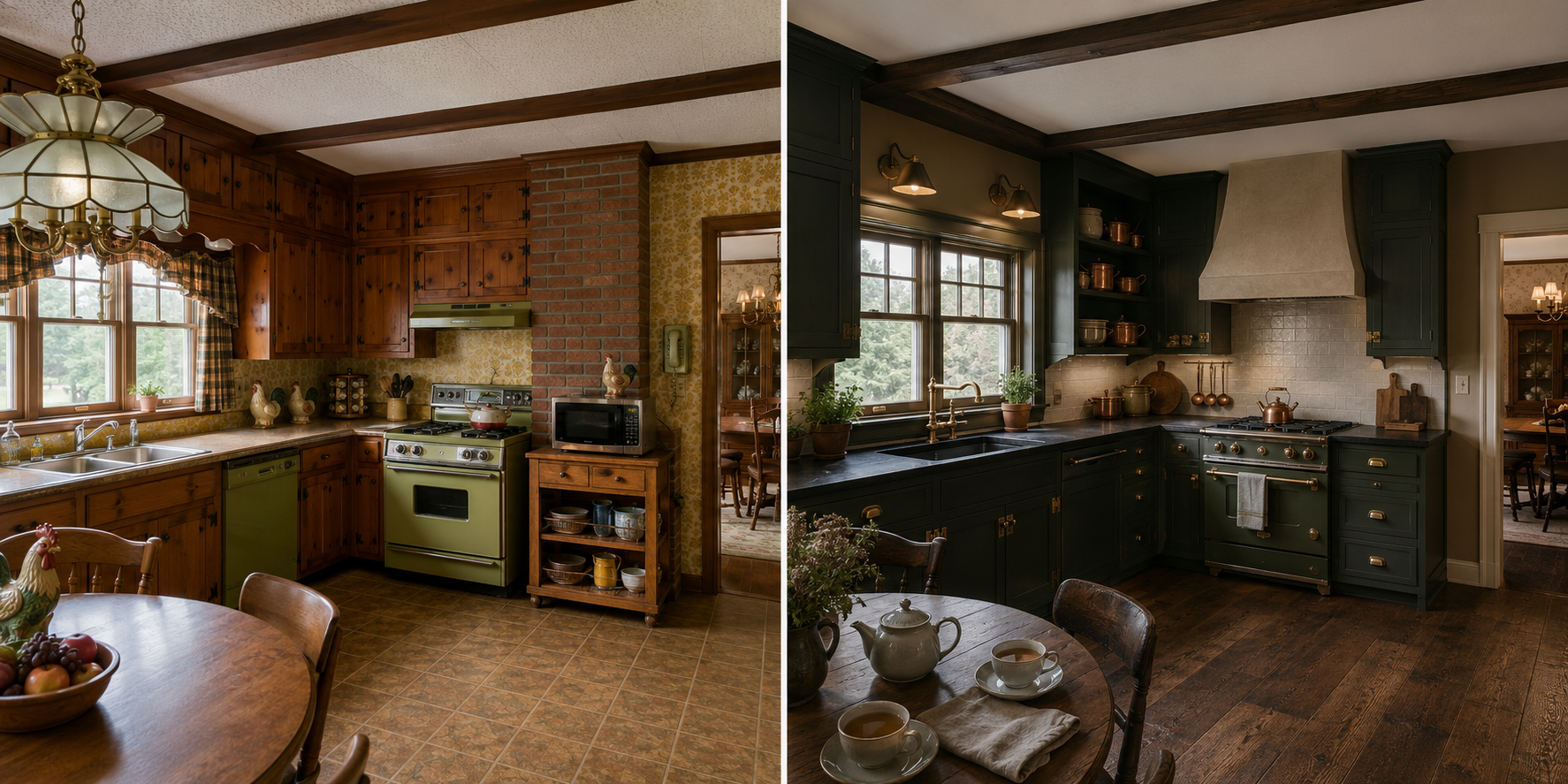
A dark green or near-black cabinet pulls a kitchen toward heavy.
Warm metals keep the room from going gloomy. Brass faucets, copper cookware on open shelves, aged bronze handles, and a plaster range hood that catches light all give the eye somewhere warm to land. For an extra bold look, consider mixing metals within your kitchen’s design.
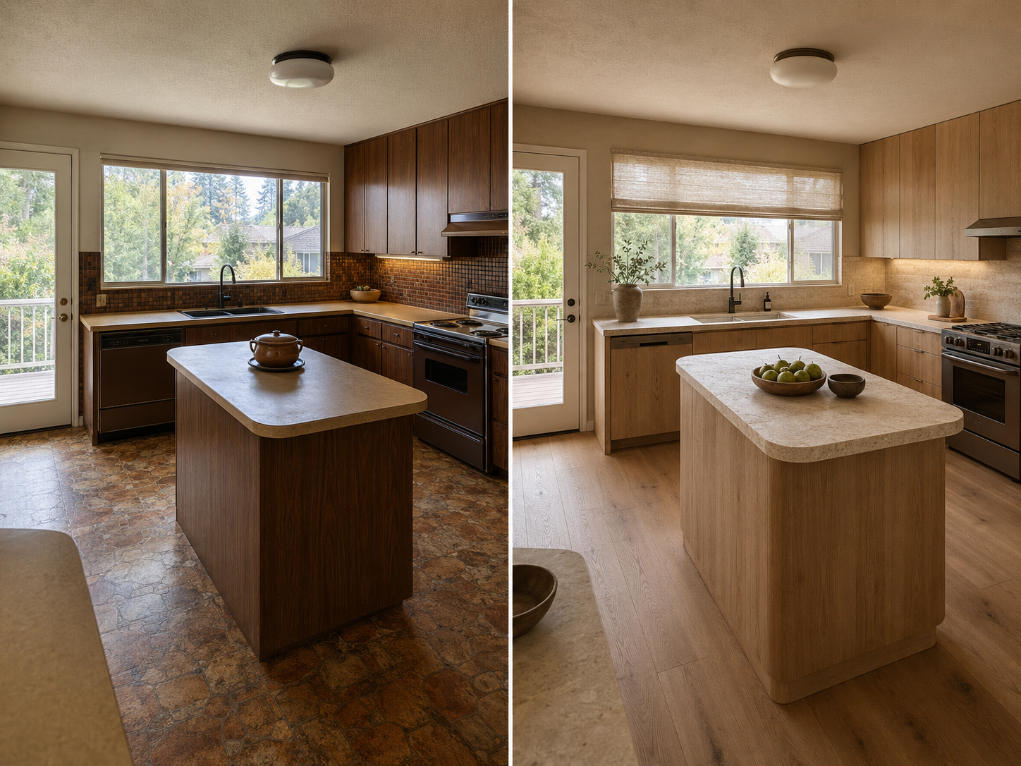
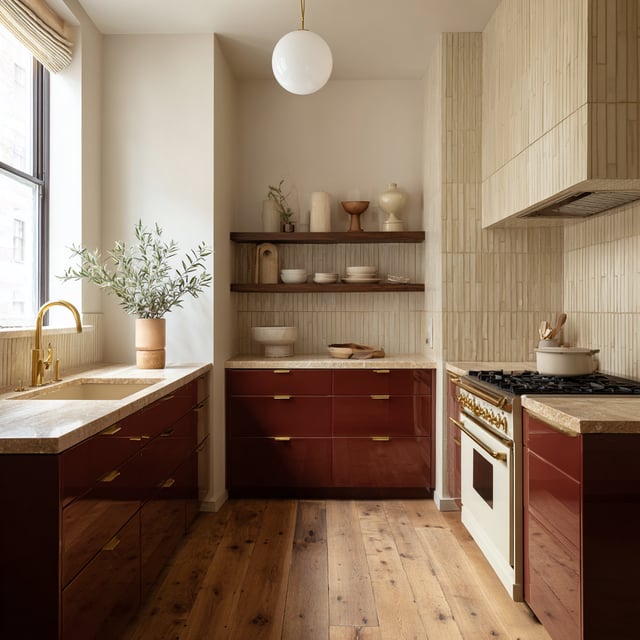
Organic modern kitchens look quiet because they are organized around texture rather than color. The wall cabinets, the floor, the island, and the range hood all sit within a narrow band of warm tans and creams, but each surface has a different feel: wood grain, stone veining, plaster, and woven shade. The approach works in older homes because it does not fight the existing floor plan.
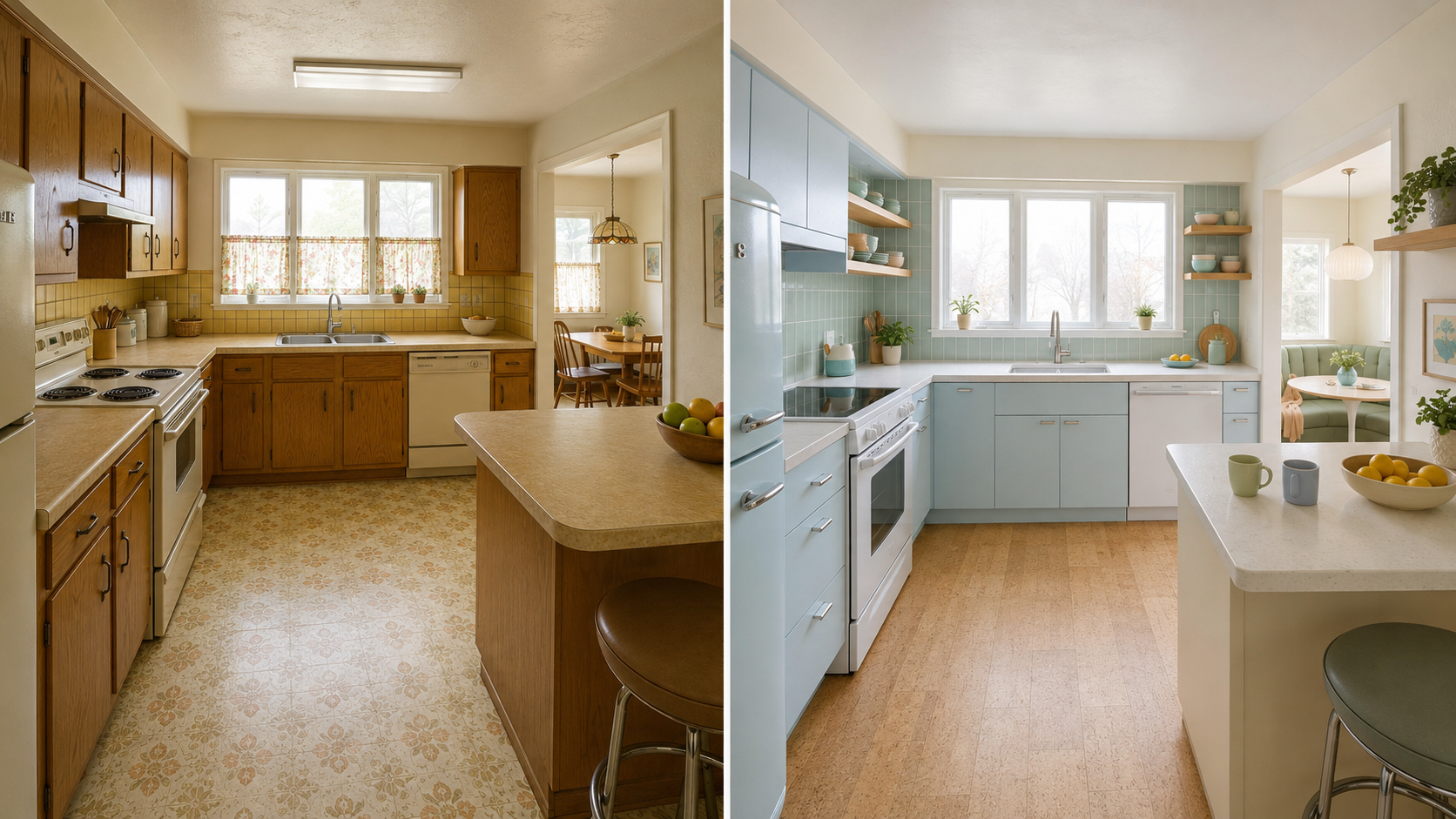
Pastels usually fail in kitchens because they get mixed with white walls, white counters, and gray hardware. The pastel ends up as a single accent rather than the room's logic.
Committing solves it. A soft sky blue on the cabinets, pale green tile, open shelving with ceramic dishes in the same family, and cork floors all push in the same direction. The pastel becomes the new neutral, which is what lets it act like one.
%20-%20Edited.png?width=2816&height=1391&name=Pastel-Themed%20retro-Future%20(Sweet%20%26%20Sleek)%20-%20Edited.png)
High-gloss lacquered cabinets are a different category. They cost more and show every fingerprint, and the installation has to be tight because a wavy reveal will always show.
The reason to consider them anyway is light reflection. A small or windowless galley benefits from surfaces that bounce light around the room, and high-gloss does this more efficiently than any other finish. Mint green cabinets, lavender geometric tile, and a chrome chimney hood support the same goal.
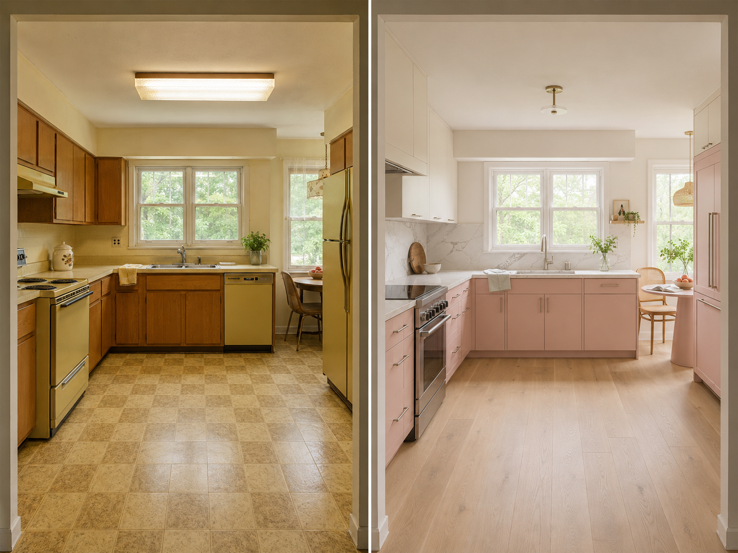
Pink as a kitchen color used to feel like novelty. That changed once designers started desaturating it.
A dusty muted pink sits closer to taupe than to bubblegum, which means it pairs naturally with marble, stainless steel, and cane chairs. Any color can play this role once it is desaturated enough.
%20-%20Edited.png?width=2436&height=1536&name=Pink-Themed%20Maximalist%20(The%20Dollhouse%20Kitchen)%20-%20Edited.png)
Painting every surface the same color changes how the eye reads the room. A fully monochrome pink galley flattens the architecture into a single field, which lets the hardware and the rugs become the focal points. Brass half-moon pulls land against the saturation. A Persian runner grounds the floor. Without the unifying color, the room would feel chaotic. With it, the strongest elements have room to speak.
%20-%20Edited.png?width=2752&height=1374&name=Purple-Themed%20Bohemian%20(Amethyst%20%26%20Ash)%20-%20Edited.png)
Plum and aubergine are underused kitchen colors. Their unfamiliarity is part of the appeal, since most people don't carry strong associations with them.
The cabinets need warm wood and warm metals near them, or they read cold. Walnut floating shelves, soapstone counters, copper pots in view, and a Moroccan-style lantern in the adjacent dining area give the deep cabinets a context.
The rest of the bohemian look is layering. Vintage rugs, mixed shelving heights, and varied light fixtures all earn their place.
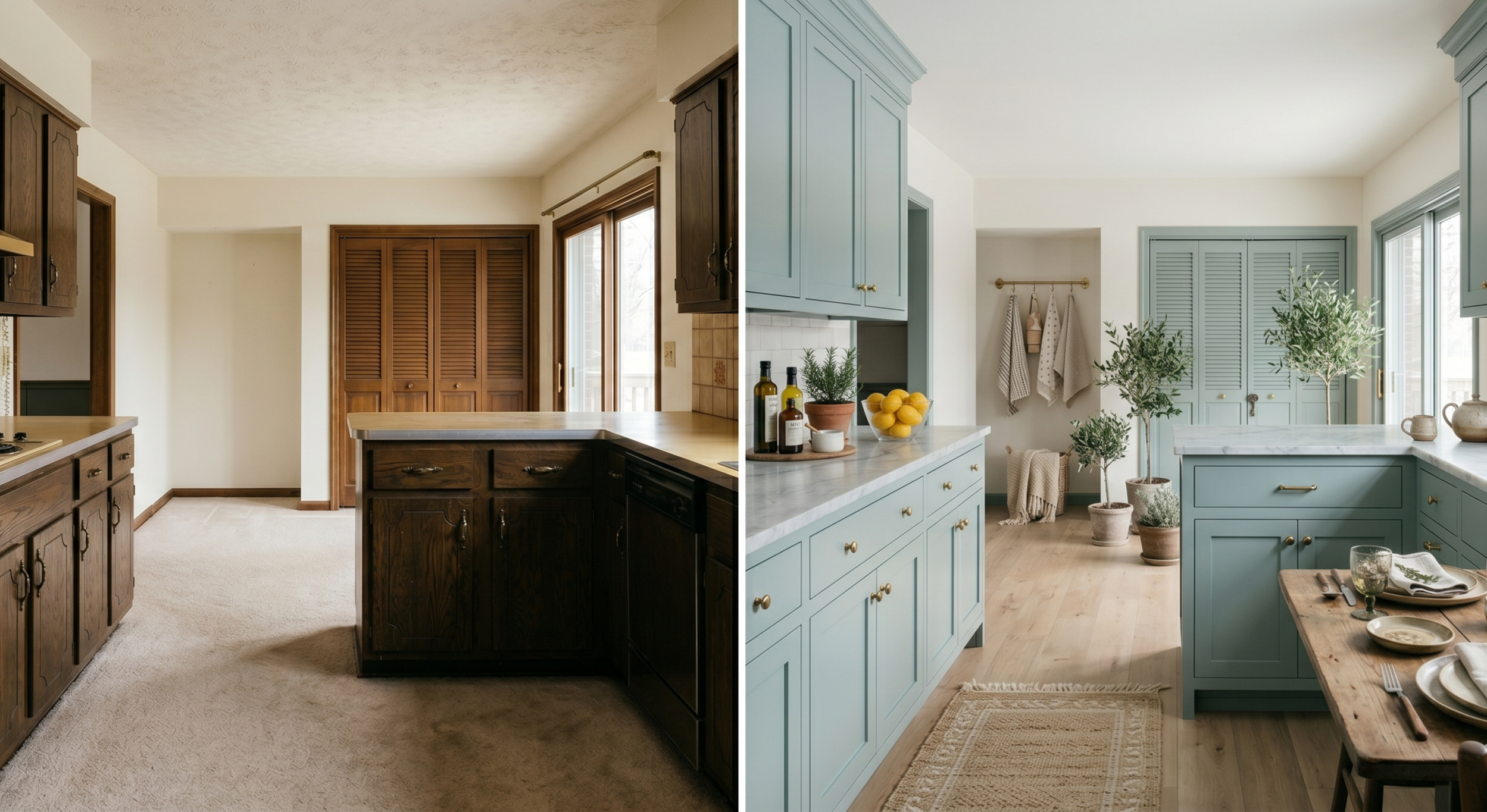
A full rip-out is not always the right move. Some 1970s details are more interesting than what would replace them, and painting around them is the cheaper, smarter route.
Louvered pantry doors are a clear example. Painted soft blue-green alongside cabinets in the same color, with brass cup pulls and wide-plank white oak floors underneath, the doors become architectural rather than dated. Removing carpet from the room is one of the highest-impact changes available in any 1970s kitchen, both for cleanliness and for sound.
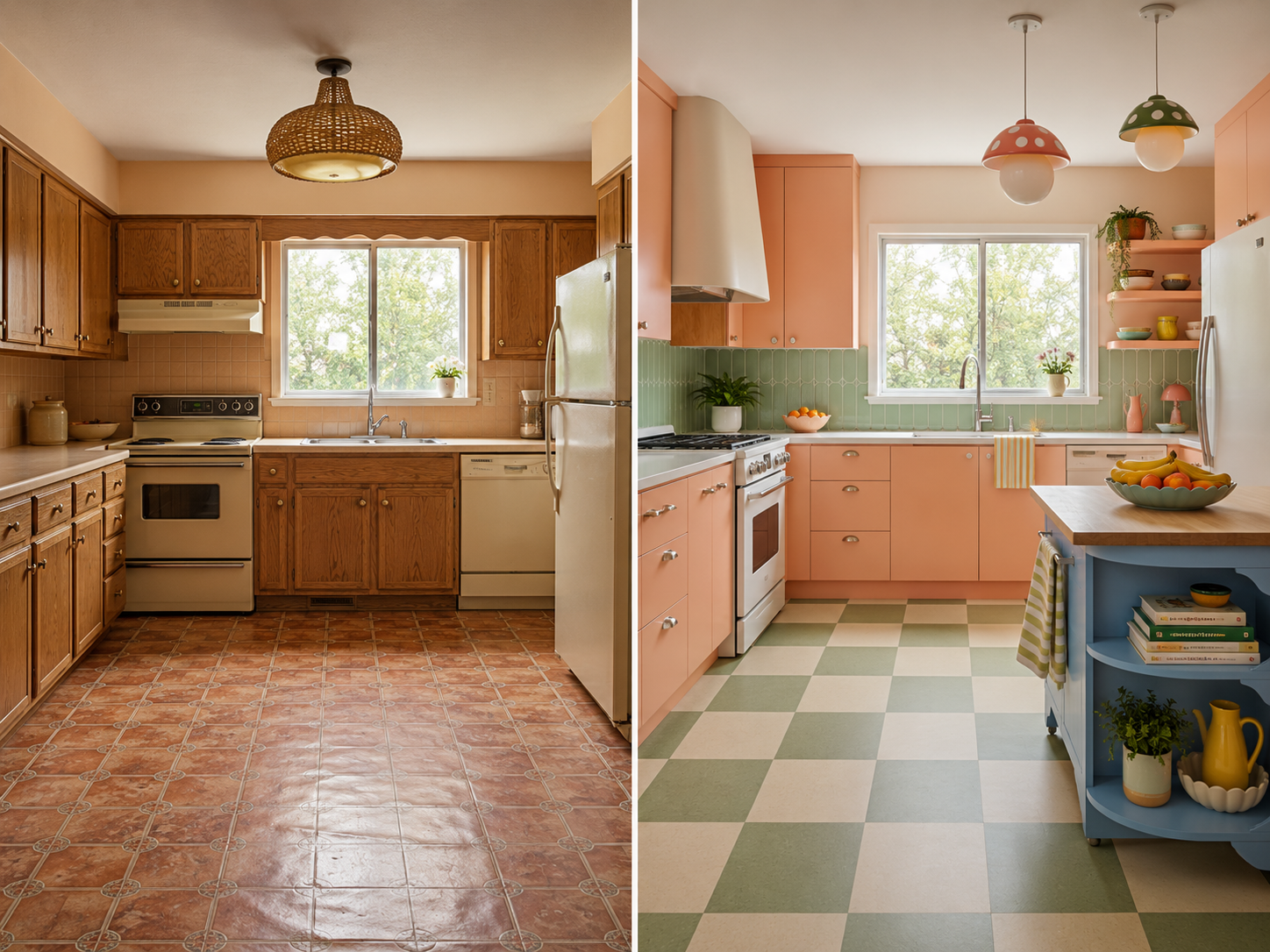
A whimsical kitchen looks effortless because most of its surfaces are quiet. The colors carry the room while the patterns stay restrained.
Peach cabinets, sage tile, mushroom-shaped pendants, a cobalt blue rolling island, and a green-and-cream checkerboard floor should be too much. They work because the cabinets are flat, the counters are white, and the backsplash is a single grid of vertical tile.
Cabinet color and tile choice are the visible part of the project, but a 1970s kitchen remodel before and after usually involves more than a finish update.
A 1970s kitchen remodel before and after is satisfying to look at, but the work behind the photo is where most homeowners feel the strain. Block Renovation handles that part.
Block matches each homeowner with vetted local contractors who have remodeled older kitchens before. The best ones compete for the project, working from a single expert-reviewed scope so quotes are directly comparable. Payments release in stages as milestones are approved, and every contractor in the network provides a one-year workmanship warranty.
Remodel with confidence through Block

Connect to vetted local contractors
We only work with top-tier, thoroughly vetted contractors

Get expert guidance
Our project planners offer expert advice, scope review, and ongoing support as needed
Enjoy peace of mind throughout your renovation
Secure payment system puts you in control and protects your remodel

Renovate confidently with Block
Easily compare quotes from top quality contractors, and get peace of mind with warranty & price protections.
Before and After
Kitchen Island Remodel: Before and After Inspo
06.26.2026

Before and After
Modern Farmhouse Kitchen Renovations Before and After
06.16.2026
Before and After
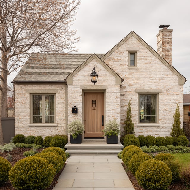
Limewash Brick Before and After: Photos and What to Know
06.10.2026
Before and After
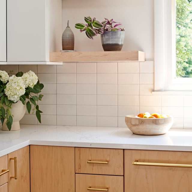
Budget Small Kitchen Remodel: Before and After Ideas
06.08.2026
Before and After
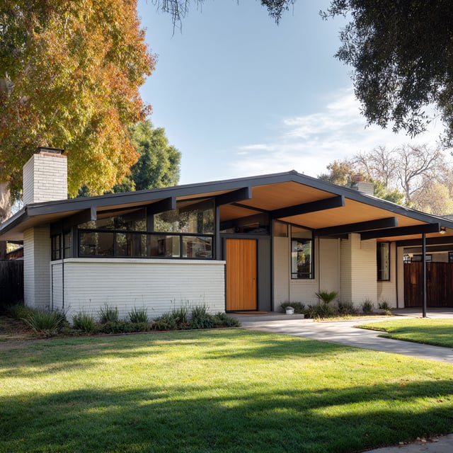
Mid-Century Modern Exterior Before and After Ideas
06.04.2026