




Before and After
Kitchen Island Remodel: Before and After Inspo
06.26.2026
05.27.2026


In This Article
A condo renovation comes with constraints that a house renovation does not. Building rules dictate construction hours. The HOA usually has opinions about flooring underlayment and contractor approvals. The plumbing stack cannot move. Elevator reservations are limited and book up weeks in advance. Material deliveries get coordinated through the property manager, and your neighbors share walls with whatever you decide to do.
None of this means a condo remodel is not worth doing. The before-and-after pairings below illustrate what design choices can do inside a fixed footprint, and each carries a lesson worth borrowing for your own project.
The condo’s kitchen is usually the one where limited space hurts the most. Plumbing and gas lines often fix the layout in place, and there is rarely room to expand. The two kitchens below take different approaches to the same problem.
The pictured before is the standard 1990s package: oak cabinets with black wire pulls, beige laminate counters, white tile floor, and a microwave hood eating up sightlines above the range.
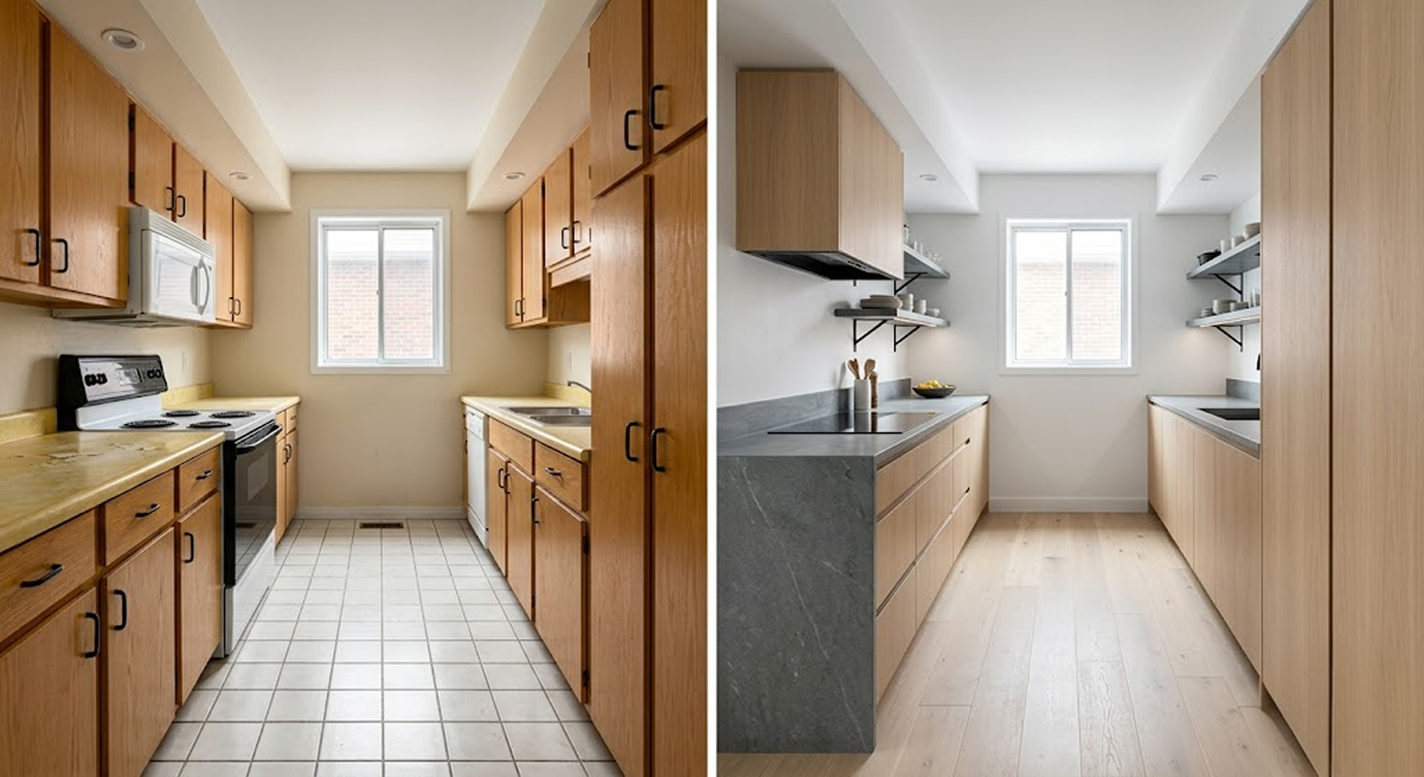
The after keeps the same footprint and the same window, but the upper cabinets, the microwave, and the visual clutter are gone. Two design moves carry the room.
The first is the waterfall stone peninsula on the left. A waterfall edge wraps countertop material down the side of the cabinet run, turning a basic base cabinet into a sculptural anchor. In any small condo kitchen remodel before and after, this is one of the highest-impact moves available, because the stone is the first thing the eye lands on when you walk into the room.
The second is the cabinetry itself. Handle-free cabinets can make any galley kitchen feel larger, because there are no pulls or knobs breaking up the run. The eye reads one continuous surface instead of a row of individual doors, which makes the corridor look longer. Combined with open shelving on the right wall, which removes the visual weight of upper cabinets entirely, the kitchen looks about a foot wider than it actually is.
In a U-shaped condo kitchen, three walls already compete for attention. A strong pattern repeated across all of them tips the room into busy fast. Contained to a single surface, the same pattern can carry the whole space.
The before image is a classic mid-century co-op kitchen: light oak cabinets, white tile backsplash, and a window anchoring the back wall above the sink.
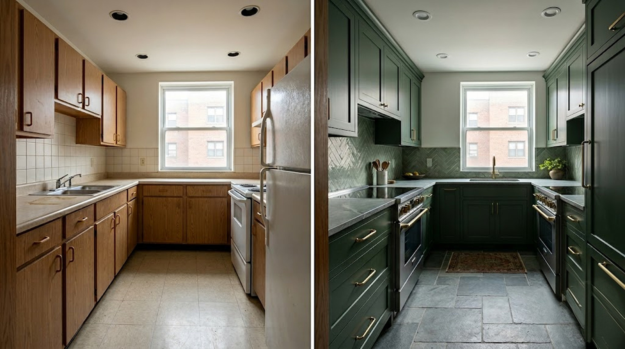
The after keeps the same U-shape, the same window, and the same appliance positions. Cabinets are now Shaker-style in a deep forest green. Hardware is unlacquered brass. Counters are honed soapstone. The fridge is panel-ready, hidden behind matching green millwork.
The standout detail is the backsplash. Glazed green ceramic tile, set in a vertical herringbone pattern, climbs the wall behind the range and continues around the window. It uses the same color family as the cabinets, but the texture and direction of the pattern give it its own role.
A herringbone backsplash adds movement on a surface that would otherwise look like a flat color block, and because it is contained to a small area, it does not overwhelm the room. A bold patterned wallpaper or a more dramatic feature wall would have tipped the U-shape into chaos. The backsplash, tucked between cabinets and counters, holds the eye without demanding it.
Condo bathrooms have less square footage than almost any other room in the unit, and they carry more constraints. Wet walls cannot move easily. Tubs and toilets stay where the stack puts them.
Small bathrooms come with a default piece of advice: keep walls light to make the space feel bigger. The pairing here argues the opposite.
What you see in the before is a builder-grade compromise: beige walls, white laminate vanity, framed sliding glass shower doors, and an overhead fixture that washes everything in cool white light.
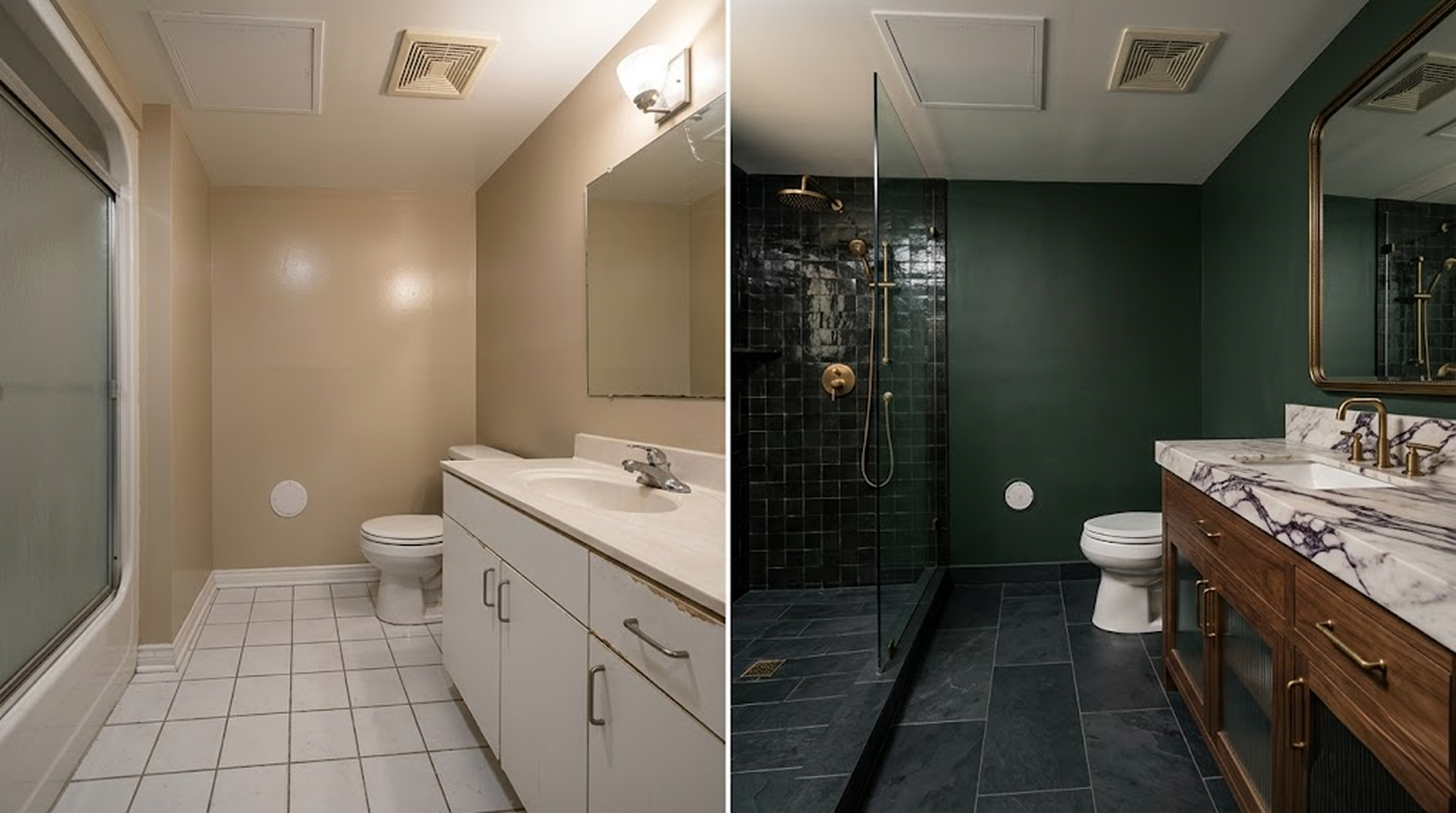
Walls in the after are deep forest green. The shower wall is wrapped in handmade black zellige tile, slightly varied in finish so each tile catches light differently. The vanity is walnut with veined Calacatta Viola marble. Plumbing fixtures are brass. The mirror is brass-framed. The shower glass is frameless.
Two lessons sit underneath this comparison. The first is that going dark and saturated in a windowless bath can come across as deliberate luxury rather than cramped. It commits to being a small, atmospheric room, and the result is more interesting than a beige-on-beige version of the same square footage would have been.
The second is about material mixing. Zellige, marble, walnut, and brass all live in the same small space without competing, because each one has a defined role. The tile is the textural backdrop. The marble is the focal piece. The walnut is the warm middle tone. The brass ties everything together at the hardware level. In a condo bathroom remodel before and after, picking one hero finish per surface and letting them play off each other is what creates richness without clutter.
Two relatively inexpensive moves can change how a small bathroom feels more than a tub-to-shower conversion or a tile swap.
In the before, the bath has a wood vanity with a drop-in oval sink, a four-bulb Hollywood-style vanity bar, white square tile in the tub surround, and small mosaic tile on the floor. None of it has a particular point of view.
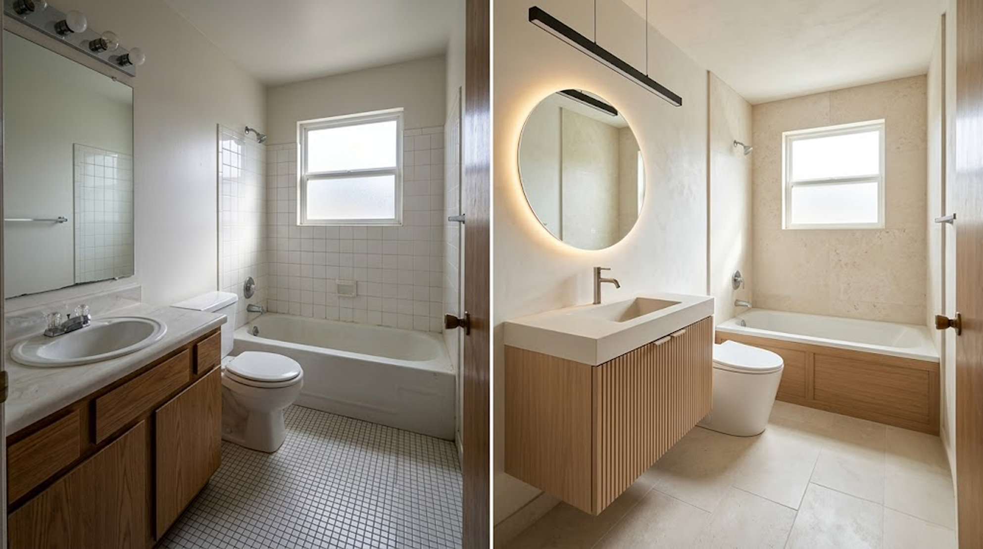
The after is centered on two material decisions. The walls are lime plaster. The tub surround and floor are travertine slab. A floating wood vanity, finished with vertical fluting and topped with a stone basin sink, replaces the old built-in. A round backlit mirror sits below a slim linear pendant.
A wall-mounted vanity exposes more floor, and exposed floor is the single cheapest way to make a small bath feel bigger. Nothing about the room's dimensions has changed, but the floor now runs uninterrupted from the door to the tub. That visual breathing room is what makes the space feel calm. The same vanity built as a standard floor-mounted cabinet would have closed the room back in.
Lighting completes the room. A backlit mirror and a linear pendant together cost about the same to wire as a single Hollywood bar, but the result feels custom. The backlight gives soft ambient light for evenings. The pendant gives task light for the mirror. In any condo bathroom remodel, lighting is one of the lowest-cost ways to make a space feel intentional.
A condo remodel rarely stops at the kitchen and bath. Dining rooms, bedrooms, and living rooms in condos tend to be smaller than their counterparts in single-family homes, which changes the math on where to spend money and how much.
This pairing is mostly cosmetic, but one decision drives most of the change.
The starting point has small ceramic tile, mismatched dinette chairs, a vintage table, and a generic brass chandelier. The room is bright and clean, but the floor adds nothing.
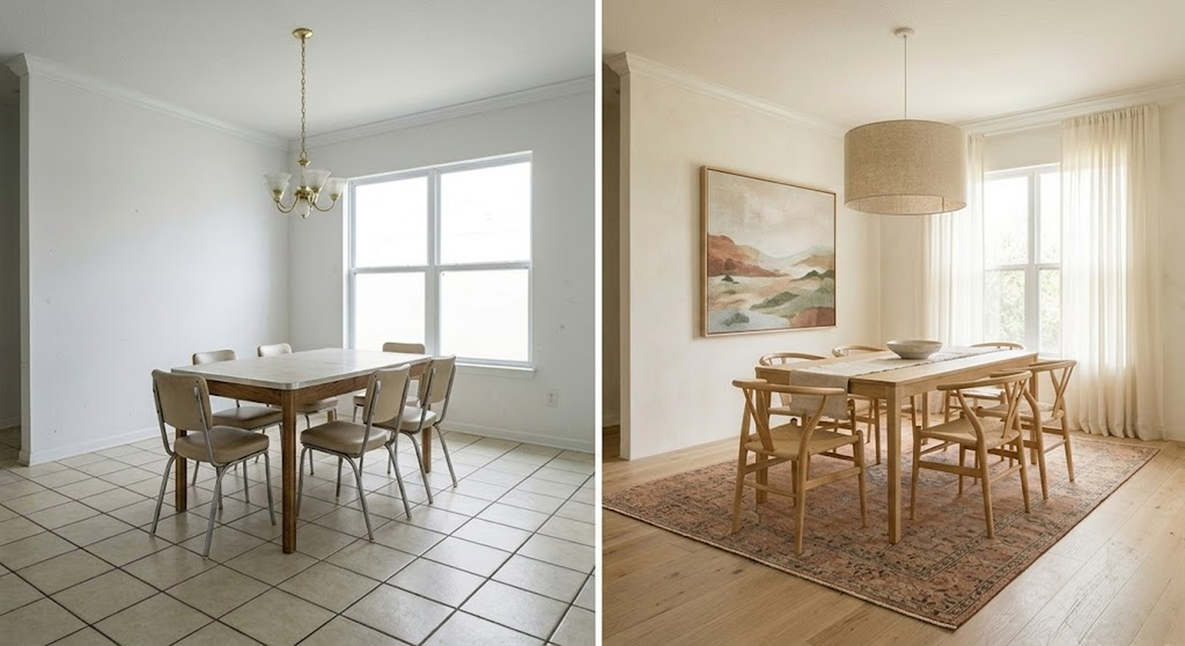
The after has wide-plank white oak floors, wishbone chairs around a longer oak table, a drum pendant, sheer drapes, and a layered landscape print on the wall. The windows, the crown molding, and the opening to the next room are unchanged.
A condo is the perfect place to splurge on quality flooring. The math works in two directions. Less square footage means a lower total cost, so European oak or rift-and-quartered hardwood that would be out of budget in a 3,000 square foot house becomes feasible in an 800 square foot condo. At the same time, each individual board sees more foot traffic, because the same people walk over a smaller floor area every day. A higher-grade wood with a more durable finish pays back twice in a condo: in the look, and in the longevity.
The corollary is that cheap flooring fails faster in a small space. Engineered planks with thin wear layers, low-grade laminate, or sheet vinyl that would last in a guest room get hammered in a condo, because there are no quiet zones. If there is one line item in a condo renovation before and after worth pushing the budget on, this is usually it.
In a smaller bedroom, lighting and hardware carry a much higher share of the room's character than they would in a larger one. That works in your favor when you choose well, and against you when you do not.
The before is clean but generic: light gray walls, wall-to-wall carpet, white closet doors with basic knobs, and a single flush-mount ceiling light.
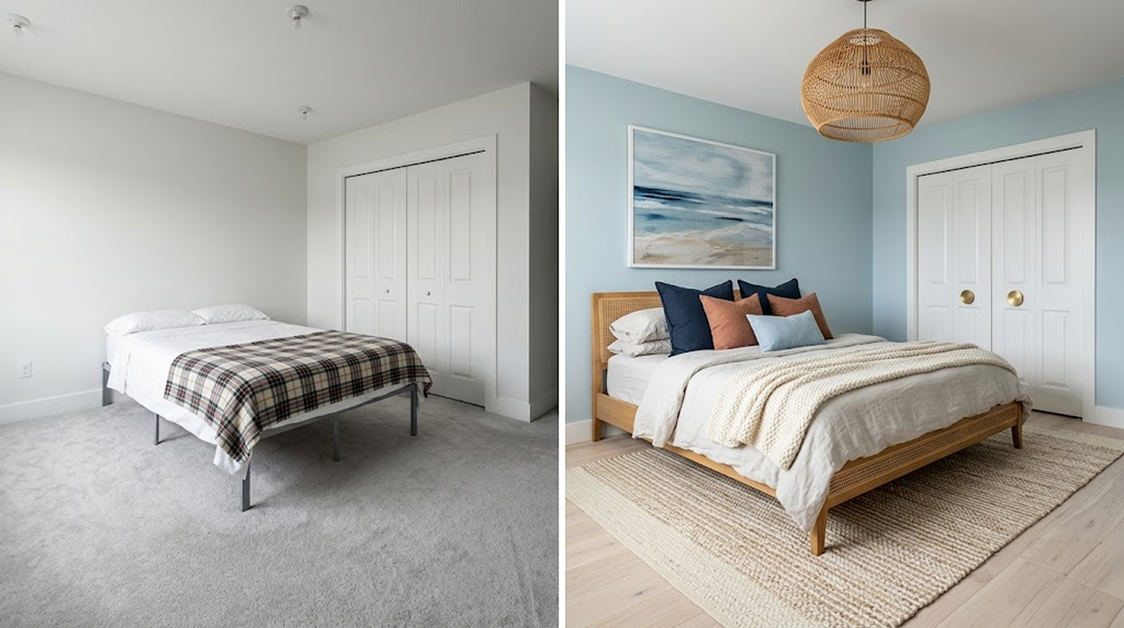
The after keeps the same bones and changes four things. The walls are now a soft blue. The carpet is replaced with wide-plank wood. There is a rattan pendant in place of the flush mount. The closet doors have brass knobs instead of white plastic.
In a 12x12 bedroom, a single pendant is responsible for a much larger share of the room's character than it would be in a 20x25 primary suite, because there is less competing visual information around it. The same logic applies to closet hardware. Two brass knobs on otherwise plain doors look like a deliberate design choice in a small bedroom, where in a larger room they would get lost.
This works in the other direction too. Generic builder-grade hardware and a basic ceiling fixture look cheap in a small bedroom in a way they would not in a larger one, because they have nowhere to hide. If you are budgeting a condo before and after, light fixtures and door hardware are two of the line items that punch above their weight, and they almost always come in under what most homeowners assume they will cost.
Two patterns separate a designed-looking condo living room from an assembled-looking one. Neither requires construction.
Looking at the starting point, the room has gray walls, gray carpet, a brown microfiber sofa, and a small white prefab fireplace. Nothing is wrong. Nothing is particularly interesting either.
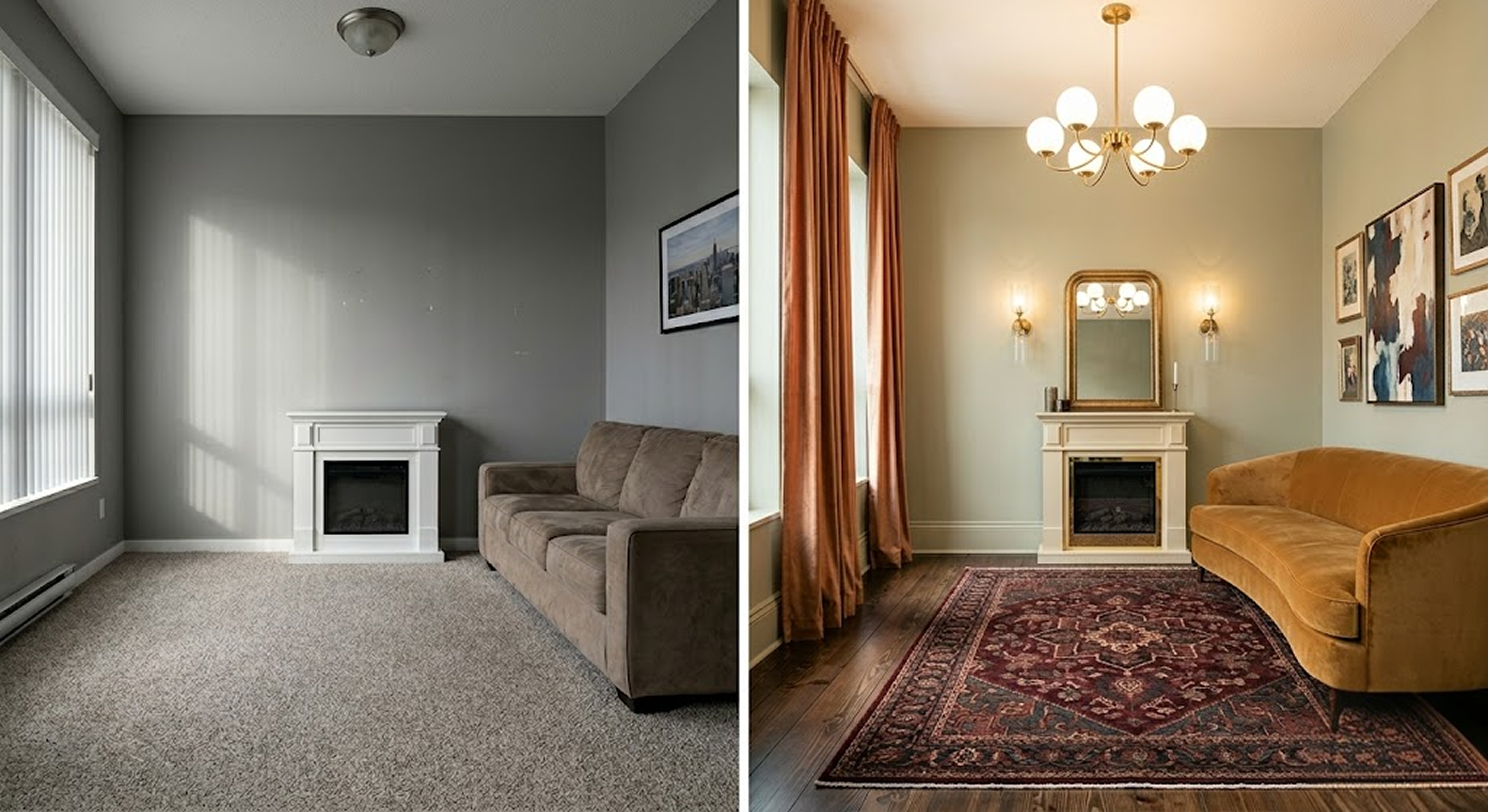
The after keeps the fireplace, the window, and the room's proportions, and changes nearly everything else. The walls are a warm olive. The floors are wide-plank dark walnut. The drapes are rust velvet, hung floor to ceiling and pulled wider than the window frame. A curved ochre velvet sofa replaces the rectangular brown one, paired with a deep red Persian rug. The fireplace gets a gold-framed mirror and flanking sconces.
The first pattern worth borrowing is color temperature. Warm earth tones like rust, ochre, olive, and deep red feel collected and intentional, where default gray feels builder-grade. Gray became the safe choice in the 2010s because it offends nobody, but it also commits to nothing. Earth tones commit, and the room feels like a person actually lives there.
The second is architectural. Wall sconces flanking the mantel mirror create symmetry and a focal point, which is the kind of move that older, more expensive homes already have built in. Most condos do not have built-in architectural detail. You can add it through small, deliberate placements: a pair of sconces, a substantial mirror, full-height drapes. Together they make a builder-grade room feel designed rather than assembled.
A condo renovation rewards thorough planning more than almost any other kind of project. A general contractor who has never worked in a condo before will run into surprises that someone experienced in multi-unit buildings will not.
Block Renovation gives homeowners a layer of protection from the places condo projects most often go wrong:
We partner condo owners with the right talent, everywhere from Florida to New York to Maryland.
Remodel with confidence through Block

Connect to vetted local contractors
We only work with top-tier, thoroughly vetted contractors

Get expert guidance
Our project planners offer expert advice, scope review, and ongoing support as needed
Enjoy peace of mind throughout your renovation
Secure payment system puts you in control and protects your remodel

Renovate confidently with Block
Easily compare quotes from top quality contractors, and get peace of mind with warranty & price protections.
Before and After
Kitchen Island Remodel: Before and After Inspo
06.26.2026

Before and After
Modern Farmhouse Kitchen Renovations Before and After
06.16.2026
Before and After
Limewash Brick Before and After: Photos and What to Know
06.10.2026
Before and After
Budget Small Kitchen Remodel: Before and After Ideas
06.08.2026
Before and After
Mid-Century Modern Exterior Before and After Ideas
06.04.2026